Every now and then a user asks a question about how to customize the appearance of the FV Player on their website. Modifying the scheme and the font can be done very easily in the Skin settings (here’s a guide on how to do that – Customizing FV Player Skin), but there is a lot of other things you can set up outside the Settings screen just by applying some basic CSS knowledge.
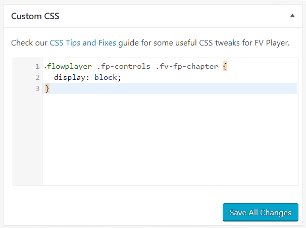
To add CSS tweaks, use FV Player’s Custom CSS field. You access it by going to Settings -> FV Player -> Skin:
Custom CSS can also be added to your theme’s stylesheet in WordPress admin.
You might find that the rule does not work. To boost the importance of the CSS rule, make sure you prepend more selector classes or IDs in front of it. Just adding #content should help with most templates.
If the new CSS rule really doesn’t work, you can try to append !important to it to verify if it can work. That way something like:
.flowplayer .fp-captions p {
   font-size: 24px;
}
Becomes:
.flowplayer .fp-captions p {
   font-size: 24px !important;
}
So !important gets added before the ; symbol on the row which you want to give priority to.
This article lists just a few of the infinite amount of things you can do with CSS. These tips were requested by our users and are now available in one list, so that everyone can benefit from them:
General
- Making a Frame Around the Video
- Fixing Right-to-Left Player Controls
- Removing the Black Background at the Beginning of a Video
- Adding a Shadow Under the Video Box
- Editing the Play Icon
- Changing the Play Icon Color
- Hiding the Play, Pause and Loading Icons
- Showing the Play Icon when video paused
- Making the player left-aligned by default with text appearing below it
- Changing splash text size
- Removing dark gradient from top controlbar
- Scale video to always fill player area
- Hide video names/titles
- Prevent pause/resume when clicking the video
- Hide the “Click to unmute” button
- Change “Click to unmute” color and size
- Avoid black bars on sides of video on mobile in fullscreen
- Disable Double Tap On Mobile
- Rounded borders
- Show pause button for audio player at all times
- Show play button at the end of video
- Player background when No Picture button is clicked
- Hide Embed button
- Remove Spacing Below Player
Control bar
- Make controls bigger
- Hiding the controlbar
- Prevent timeline seeking
- Make the controlbar visible at all times
- Changing the Color of the Buttons and Time
- Changing the Button Icons
- Ensure control bar doesn’t cover video in fullscreen
- Hide video duration and playtime
- Hide pause/play button
- Hide the Airplay button
- Hide volume bar and use the mute button only
Subtitles
- Editing the Subtitles With CSS
- Increasing the Subtitles Font Size in Fullscreen
- Changing width of the subtitles field
- Moving Subtitles Under the Video
- Removing Subtitles Button
Playlist
- Hiding Item button in controlbar
- Hiding the prev/next item buttons on controlbar
- Hiding the prev/next item buttons in overlay of the Prev/Next playlist style
- Hiding the “Now Playing” pulse effect
- Move Tabbed Playlist Tabs to the Bottom
- Align Tabbed Playlist Tabs to the Right
- Change playlist thumbnail size
- Force 3 playlist thumbnails per row on wide templates
- Set font size to horizontal and slider playlist style
- Set font size to text playlist style
- Use two columns for vertical playlist style
- Right-to-Left Adjustments
Lightbox
Sticky Video
- Adding controls to sticky player
- Set custom width for mobile
- Aligning sticky video with the sidebar
- Set sticky player z-index
Popups
- Making sure the popup covers the whole video
- Changing the popup size
- Allowing popup background to resume the video
- Using transparent background
- Email Popup Colors
Interactive Transcript
Chapters
- Editing .VTT chapters titles
- Show chapters menu in controlbar
- Center chapters below the player
- Put chapters into more columns
- Add text above the chapters
- Move chapters from below the player to the right hand side
Overlay ads
Video ads
FV Player Pay Per View
- Center the video overlay buy buttons verically
- Hide controlbar in splash state
- Invoice Watch button color
- Removing buy buttons below the video
General
Making a Frame Around the Video
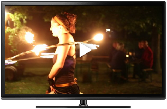
Here’s a quick guide on creating a custom frame from an image and have the FV Player placed inside it.
You will need an image that will serve as the frame in the background, preferably in .png format. To make the player fit, you have to set the size of the video in accordance with the background image. To set the size and other features of the image, you will need to wrap the video in a <div> tag with custom id. The id will be styled in CSS and will contain the background image itself, size, and padding. The padding needs to be set individually for every theme, so you’ll have to give it a couple of tries to make it fit perfectly.
The size of the background image is 608×395 px and the video is 573×324 px, which is the size of the screen of the TV frame. Here is the selector used in this example:
#frame
{
    background: url('https://foliovision.com/images/2016/10/device-tv2.png') no-repeat;
    background-size: 608px 395px;
    padding: 16px 112px 90px 0px;
}
Note: Please keep in mind that this solution is not responsive and won’t work properly on mobile devices.
Fixing Right-to-Left Player Controls
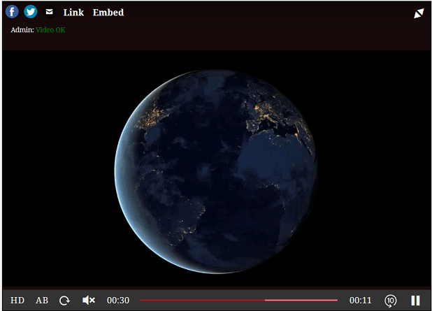
If you are using an RTL (Right-to-Left) language on your website (for instance Arabic, Syriac or Hebrew), it is possible that FV Player’s settings get switched horizontally and will look like this:
This might be caused by a declaration like this in your CSS:
body {
  direction: rtl;
}
If you want to revert that, simply add the following CSS rule to your theme’s stylesheet (or a custom CSS file or field):
.flowplayer {
  direction: ltr !important;
}
.flowplayer.is-rtl .fp-icon {
  transform: rotate(0);
}
Removing the Black Background at the Beginning of a Video
When the video is loading and hasn’t started yet, a default black background is visible for a fraction of a second.
If you’d like to remove it (by making it transparent), you can use this code:
.container .flowplayer {
  background-color: transparent !important;
}
Adding a Shadow Under the Video Box
This is a simple effect that will add some depth to your website’s design:
To add this effect, use this code:
.flowplayer .fp-player {
  -webkit-box-shadow: 0px 35px 10px -25px #aaaaaa;
  -moz-box-shadow: 0px 35px 10px -25px #aaaaaa;
  box-shadow: 0px 35px 10px -25px #aaaaaa;
}
Editing the Play Icon
.flowplayer .fp-play.fp-visible svg {
  opacity: 0;
}
.fp-play:before {
  background-image: url(https://your-website.com/wp-content/uploads/2022/10/your-image.png);
  background-position: center;
  background-repeat: no-repeat;
  background-size: contain;
  width: 6em;
  height: 6em;
  content: ' ';
  position: absolute;
  top: 0;
  left: 0;
  margin: auto;
  right: 0;
  bottom: 0;
  opacity: 0;
  transform: scale(0.8);
  transition: all .2s;
}
.flowplayer.is-small .fp-play:before, .flowplayer.is-tiny .fp-play:before {
  max-height: 30%;
}
.fp-play.fp-visible:before {
  opacity: 1;
  transform: scale(1);
}
The icon size is controlled using width and height properties. transform: scale(0.8); and transform: scale(1); set the animation when resuming the video.
Changing the Play Icon Color
If you like the play/pause icons and only need to change the color, where’s how it’s done:
.flowplayer .fp-ui .fp-play .controlbutton, /* play icon */
.flowplayer .fvp-icon .svg-color /* pause icon */ {
  fill: #27CE73;
}
.fp-preload b /* loading indicator */ {
  background-color: #27CE73;
}
If you use the “Playful” icon set, here’s how to adjust the color around the play icon:
.flowplayer.fp-playful .fp-color, .flowplayer.fp-playful .fp-color-play {
  background-color: blue;
  fill: blue;
}
Hiding the Play, Pause and loading icons
When clicking play, the play icon appears for a brief moment to signify the beginning of playback. The same thing happens with the pause icon when the video is paused. When a video is loading, the loading animation appears. You can make your video playback visually cleaner and seamless by hiding these icons. Here’s how:
Use this rule to hide the play icon:
.flowplayer .fp-play {
    display: none !important;
}
Use this rule to hide the pause icon:
.flowplayer .fp-pause {
    display: none !important;
}
Use this rule to hide the loading animation:
.flowplayer.is-splash .fp-preload, .flowplayer.is-poster .fp-preload, .fp-waiting .fp-preload {
    display: none !important;
}
The !important bit is there to ensure the loading indicator is not visible even if using “Optimize JavaScript loading”.
Showing the Play Icon when video IS paused
Normally the play icon goes away once you click to play the video and only shows for a fraction of second with animation when you paused the video and then resume it. Here’s how you can make sure it shows when the video is paused:
.flowplayer.is-paused .fp-play svg {
  opacity: 1;
  transform: scale(1.5);
}
Changing splash text size
If you want to change splash text size apply following CSS code:
.fv-fp-splash-text {
font-size: 18px;
}
Removing gradient from top of the player
If you want to remove gradient from top of the player use this code:
.flowplayer .fp-header {
background-size: 0 0;
}
Scale video to always fill player area
If you want to scale and crop your video to always fully fill the player window please use the following code:
.flowplayer .fp-engine {
  object-fit: cover;
}
Hide video names/titles
Useful if you like to name your videos in the editor, but want to hide that information in front-end. It removed the title below the player and also from playlist thumbnails.
.fp-caption, .fp-title, .fp-playlist-external h4 {
  display: none;
}
Prevent pause/resume when clicking the video
Clicking anywhere in the video will pause the playback, then clicking again will resume the playback. We can disable clicks to the main player UI element and the video and then restore it for the UI elements to avoid this behavior.
.flowplayer.is-ready .fp-ui, .flowplayer.is-ready .fp-engine {
  pointer-events: none;
}
.flowplayer.is-ready .fp-ui > * {
  pointer-events: all;
}
Hide the “Click to unmute” button
When a new viewer first accesses your website, a “Click to unmute” notice will appear on all videos that are set to autoplay. Due to browser restrictions, autoplay has to begin muted. This notice serves as a visible reminder, that the video is muted.
If you have videos that you wish would remain muted, that do have audio tracks with no sound, or you just don’t like the notice, you can easily hide it with this CSS fix:
.flowplayer.has-fp-message-muted .fp-header { display: block !important }
.flowplayer .fp-message-muted { display:none !important; }
Change “Click to unmute” color and size
You can also change the color of the notice and the over size:
.flowplayer .fp-message-muted {
  /* Background color */
  background-color: rgba(255,255,255,.5);
  /* Text color */
  color: black;
  /* Text and icon size */
  font-size: 1.5em;
}
Avoid black bars on sides of video on mobile in fullscreen
If you videos are 16:9 you will get black bars when viewing on a 19:9 mobile in fullscreen. This tweak ensures the video always covers the entire display on wide mobile devices:
@media (min-aspect-ratio: 16/9) {
  .flowplayer.is-fullscreen video {
    object-fit: cover;
  }
}
Disable double tap on mobile
While watching on mobile, you can double tap the right or the left corner of your screen to seek 10s forward or backward.
If you do not like the way it works or find it disturbing, you can easily disable it:
.fv-fp-tap-left, .fv-fp-tap-right {
  display: none;
}
Rounded borders
.flowplayer,
.flowplayer .fp-splash,
.flowplayer .fp-player .fp-splash,
.flowplayer video,
.flowplayer iframe.fp-engine,
.flowplayer .fp-ui {
    border-radius: 1em !important;
}
.flowplayer .fp-header, .flowplayer .fp-message {
    border-radius: 1em 1em 0 0;
}
.flowplayer .fp-controls {
    border-radius: 0 0 1em 1em;
}
Show pause button for audio player at all times
If you use splash screens with the audio tracks this might come handy. Normally the pause button only shows on hover.
.flowplayer.is-audio.is-playing .fp-pause {
  opacity: 1;
}
.flowplayer.is-audio.is-playing .fp-pause svg {
  opacity: 1;
  transform: scale(1.5);
}
Show play button at the end of video
In one of the future FV Player versions we might add a special icon for video re-play, but here’s code to show play at the video end:
.flowplayer.is-finished .fp-play svg {
  opacity: 1;
  transform: scale(1.5);
}
Player background when No Picture button is clicked
When user hits the No Picture button he normally gets a black screen. It can show any image instead using the following CSS:
.flowplayer.is-no-picture .fp-player {
  background: url(https://site.com/image.jpg);
  background-size: cover;
}
Hide Embed button
The Embed button can be disabled, but then the <iframe> code stops working. So you can just hide the Embed button using CSS:
.flowplayer .embed-code-toggle {
  display: none;
}
Remove Spacing Below Player
FV Player normally puts 2em of margin after the player element. This adds the required spacing if posting videos in blog articles.
If you place FV Player differently, it might be useful to remove the bottom spacing using this CSS:
.freedomplayer {
  margin: 0 auto;
}
Control Bar
Make controls bigger
The control bar font is set to 14 pixels for desktop and 12.6 pixels for mobile. That affects the overal control bar height and the size of the buttons too.
Here’s how to make all of that bigger:
.flowplayer {
  font-size: 18px;
}
.flowplayer.is-small:not(.is-fullscreen) {
  font-size: 16px;
}
.flowplayer.is-tiny:not(.is-fullscreen) {
  font-size: 15px;
}
Hiding the Controlbar
You might want to do away with the whole controlbar to achieve a clear player with no controls.
Hiding the controlbar depends on the player skin you are using. For example, if you are using the Custom skin, the fix would look like this:
.flowplayer.skin-custom .fp-controls, .flowplayer.skin-custom .fv-player-buttons a:active, .fv-player-buttons a {
  display:none
}
Do not forget to change the name of the skin accordingly.
Prevent timeline seeking
This prevents users from easily seeking in the video while showing a “not allowed” icon.
.flowplayer .fp-timeline {
  pointer-events: none;
}
.flowplayer .fp-controls {
  cursor: not-allowed;
}
.flowplayer .fp-controls *:not(.fp-timeline) {
  cursor: pointer;
}
Make the controlbar visible at all times
Normally the control bar disappears after couple of seconds of inactivity. There is the “Controlbar Always Visible setting, but that moves the controlbar below the video to make sure it doesn’t cover any part of it.
If you want to show the controlbar over the video at all times, here’s the code:
.flowplayer .fp-ui > * {
  opacity: 1;
}
.flowplayer .fp-ui {
  background-image: linear-gradient(to top, rgba(0, 0, 0, .25), transparent 15%);
}
Changing the Color of the Buttons and Time
Most of the elements on FV Player’s control bar can be changed in the Skin settings. You can find the Buttons and Time colors right there.
Changing the Button Icons
Here’s how to change the volume button icon, in the audible and muted state. The dimensions are set to 24 x 24 pixels.
For background: url(...) you can either use a link to your image or the base64 encoded image (data:image/png;base64,...).
.flowplayer .fp-controls .fp-volumebtn {
  width: 24px;
  height: 24px;
  position: relative;
}
.flowplayer .fp-controls .fp-volumebtn:before {
  content: '';
  background: url(...);
  width: 24px;
  height: 24px;
  position: absolute;
  top: 0;
  left: 0;
  background-repeat: no-repeat;
}
.flowplayer.is-muted .fp-controls .fp-volumebtn:before {
  content: '';
  background: url(...);
  background-repeat: no-repeat;
}
Ensure control bar doesn’t cover video in fullscreen
Normally the video size is adjusted to cover the entire screen when playing in fullscreen mode. The code below adds a bit of space at the bottom to ensure the controlbar can appear. Use together with the “Controlbar Always Visible” setting.
.flowplayer.is-fullscreen.fixed-controls .fp-engine {
  height: calc(100% - 2.4em) !important;
}
.flowplayer.is-fullscreen.fixed-controls.fp-full .fp-engine {
  height: calc(100% - 2.8em) !important;
}
Hide video duration and playtime
You might want to hide the time on the player control bar, for example to make the control bar look clean and spacious.
.flowplayer .fp-elapsed, .flowplayer .fp-duration {
  display: none;
}
Hide control bar pause/play button
You might want to hide the pause/play button on the player control bar, for example to make the control bar look clean and spacious.
.flowplayer .fp-playbtn {
  display: none;
}
Hide the airplay button
.flowplayer .fp-airplay {
  display: none !important;
}
Hide volume bar and use the mute button only
.flowplayer .fp-volumebar {
    display: none;
}
.flowplayer .fp-volumebtn {
    display: block;
}
Subtitles
Editing the Subtitles With CSS
The subtitles in FV Player can be customized in Settings > FV Player > Skin tab > Subtitles. You can change the font face, size and color of the background along with the background opacity. You can read more about it in this guide – Customizing FV Player Skin.
In case you would like to edit the subtitles beyond the options available in the player’s settings, you can use these CSS selectors.
To change subtitle position, width and text alignment, use:
.flowplayer .fp-player .fp-captions
To change subtitle color, text size and padding, use:
.flowplayer .fp-player .fp-captions p
The default values are:
font-size: 18px;
color: #fff;
background-color: #000;
padding: 0 0.4em;
border-radius: 4px;
line-height: inherited from theme
Increasing the Subtitles Font Size in Fullscreen
The size of the subtitles in fullscreen mode is already increased to 125% for better readability, yet some users might want to increase it even further. It that case you can use this CSS code to set the size yourself. Just change the font-size value:
.flowplayer.is-fullscreen .fp-captions p {
font-size: 250%;
}
You can see the result when you open this demo in fullscreen:
Changing the subtitles field width
If you want to make your subtitles field more narrow you can use this code:
 .flowplayer .fp-captions p {
	max-width: 75%;
}
Moving Subtitles Under the Video
If you are, for some reason, unsatisfied with the default position of the subtitles (in the bottom part of the video), then you can use this code to place them in a different position – under the video box.
The subtitles will be shown in a black box below the video, that will appear only when the text is loaded, so it doesn’t disrupt the design of your website. However, they will be shown in their default position when in the full-screen mode. There is one thing to remember – the code below works only if you use default text-size for subtitles, which is 16px. If you change it in your player setting, you also have to adjust the .flowplayer .fp-subtitle “bottom” property to one that will match the subtitles under your player. The sizing also depends on what is the line-height of your theme, so even if you use the default size, there might be a gap between the video and the subtitles below. Please adjust it as mentioned above with the bottom property.
You can see the adjusted caption size in the example below:
To use the subtitles in this setting with the default 16px subtitle size, apply the following CSS code:
.flowplayer:not(.is-fullscreen) {
  margin-bottom: 5.2em !important;
  overflow: visible;
}

.flowplayer:not(.is-fullscreen) .fp-captions {
  bottom: -46px !important;
  background-color: #000;
  display: block;
}

@media only screen and (max-width: 39.9375em) {
  .flowplayer:not(.is-fullscreen) .fp-captions {
    bottom: -40px !important;
  }
}

@media only screen and (max-width: 29.9375em) {
  .flowplayer:not(.is-fullscreen) .fp-captions{
    bottom: -36px !important;
  }
}
Removing Subtitles Button
This mioght be useful in extreme case, like when Vimeo is giving you useless automated subtitles and you do not want to provide your own:
.flowplayer .fp-cc {
    display: none;
}
Playlist
Hiding Item button in controlbar
Simple trick to use if you want to hide Item button in your playlist player controlbar.
.fv-fp-list {
    display: none;
}
Hiding the prev/next item buttons in controlbar
We show the playlist prev/next buttons as people are used to it from the YouTube player. Here is the CSS to hide it:
.flowplayer .fp-controls .fv-fp-prevbtn,
.flowplayer .fp-controls .fv-fp-nextbtn {
    display: none;
}
There is also the playlist button which shows when in fullscreen which can be also hidden:
.flowplayer .fv-fp-list {
    display: none;
}
Hiding the prev/next item buttons in overlay of the Prev/Next playlist style
Some users want to show a playlist without any controls or playlist item thumbnails. The Prev/Next playlist style is close to that, but it still has prev/next buttons showing on mouse hover. Here is the CSS to hide it:
.flowplayer .fp-prev,
.flowplayer .fp-next {
    display: none;
}
Hiding the “Now Playing” pulse effect
While the slow pulsing of the Now Playing playlist box is normal, we’ve heard that some people find it distracting. If you’d like to disable it, just use the following CSS code. This will also display the Now Playing playlist box in red.
.fp-playlist-external a .now-playing {
    display: none;
}
.fp-playlist-external.fv-playlist-design-2017 a.is-active h4 {
    display: block;
}
.fp-playlist-external.fv-playlist-design-2017 a.is-active h4 span {
    background-color: rgba(128, 0, 0, 0.5);
}
Move Tabbed Playlist Tabs to the Bottom
Normally the tabs would appear above the playlist, but you can move them below the player:
.fv_flowplayer_tabs_content {
  display: flex;
  flex-direction: column-reverse;
}
.fv_flowplayer_tabs_content .flowplayer {
  margin: 0 auto;
}
Align Tabbed Playlist Tabs to the Right
Normally the tabs appear left aligned, but you can align them to the other side using:
.fv_flowplayer_tabs .ui-tabs .ui-tabs-nav:after {
  clear: both;
  content: ' ';
  display: block;
}
.fv_flowplayer_tabs .ui-tabs .ui-tabs-nav li {
  float: right;
}
Change playlist thumbnail size
This works for the Horizontal and Scrollslider playlist styles.
div.fp-playlist-horizontal a,
.entry-content div.fp-playlist-horizontal a {
  width: 50%;
}
.fv-playlist-slider-wrapper div.fp-playlist-horizontal a {
  width: 300px;
}
Force 3 playlist thumbnails per row on wide templates
Normally the Horizontal playlist style shows 5 thumnails per row if above 900 pixels wide.
We do this for Sliderland and Sliderbar as well.
/* 3 items per row for Horizontal playlist style */
body .fp-playlist-horizontal.is-wide a, body .entry-content .fp-playlist-horizontal.is-wide a {
  width: calc( 100% / 3 );
}

/* 3 items per row when wide for Sliderland and Sliderbar playlist style */
body .fp-playlist-version-one.is-wide .fv-playlist-draggable, body .fp-playlist-version-two.is-wide .fv-playlist-draggable {
  --fp-playlist-items-per-row: 3;
}

/* Make sure Scrollslider is not affected */
body .fv-playlist-slider-wrapper .fp-playlist-horizontal a, body .fv-playlist-slider-wrapper .fp-playlist-horizontal.is-wide a {
  width: 200px;
}
Set font size for horizontal and slider playlist style
Here’s the standard set of rules:
.fp-playlist-external a h4 {
  font-size: 13px;
}
@media (max-width: 39.9375em){
  .fp-playlist-horizontal a h4, .fp-playlist-external a h4 {
    font-size: 12px;
  }
}
@media only screen and (max-width: 29.9375em) {
  .fp-playlist-external a h4 {
    font-size: 10px;
  }
}
The media queries for mobile make it bit harder to figure out how to adjust it properly
Set font size to text playlist style
The default size of 13 px might be a bit too small in some cases.
.fp-playlist-text-wrapper .fp-playlist-vertical a h4 {
  font-size: 1.2em;
}
.fp-playlist-text-wrapper .fp-playlist-external .dur {
  font-size: 1.2em;
}
@media (max-width: 39.9375em) {
  .fp-playlist-text-wrapper .fp-playlist-external a h4 {
    font-size: 1.2em;
  }
}
Use two columns for vertical playlist style
This rule works when the vertical playlist fits to the right hand side of he player. On mobile it shows below the player with 2 columns already.
.flowplayer:not(.is-small) + .fp-playlist-vertical {
  display: grid;
  grid-template-columns: repeat(2, 1fr);
}
The above rule is set to work only if your content column is big enough to fit a big FV Player (.flowplayer:not(.is-small)). Otherwise these thumbnails will be too small.
Right-to-Left Adjustments
If you are using an RTL (Right-to-Left) language on your website (for instance Arabic, Syriac or Hebrew), you may find that the left-align of Text playlist item titles does not suit your needs. Here’s how to change that to right-alignment.
.fp-playlist-external.fp-playlist-vertical.fp-playlist-only-captions a h4,
.entry-content .fp-playlist-external.fp-playlist-vertical.fp-playlist-only-captions a h4 {
  text-align: right;
}
You can also set the Vertical Playlist to show the playlist thumbs on the left using this CSS:
.fp-playlist-vertical-wrapper .freedomplayer.has-playlist-vertical {
    float: right;
}
Lightbox
FV Player uses fancyBox 3, so most of the CSS tweaks for it should work.
Hiding Lightbox Prev/Next
These arrows normally allow you to go from one lightboxed video to another.
.fancybox-navigation {
    display: none;
}
Transparent Video Lightbox Area
This code will allow you to make the edges of the video transparent, when the video lightbox is active. You can see how it works in the example videos below.
Regular Video Lightbox
Transparent Video Lightbox
To make the edges of the lightbox area transparent, use the following CSS code:
.flowplayer.lightbox-starter .fp-ui {
    background: transparent;
}

.flowplayer.lightbox-starter {
    background-color: transparent !important;
}
How to remove captions from lightbox
If you want to remove captions from lightbox we have an easy solution. We are using the fancyBox library, so you can just hide what you need using its CSS selectors. The CSS rule to hide fancyBox item captions is:
.fancybox-caption { display: none}
Sticky Video
Adding controls to sticky player
If you’re using sticky mode for your videos, you might have noticed some of the controls in the controlbar of this player missing. Given the small size of sticky player, we like to keep it simple. However, if you need to bring back the buttons to the player, it is super easy.
Sticky is a child element of the main player. Everything that works in the main player, can be easily added to the sticky player via CSS!
For example, here’s the CSS to show the playlist items menu on a sticky player:
.flowplayer .is-sticky .fv-fp-list {
  display: block;
}
Set custom width for mobile
Normally you can only pick one of the presets: 50%, 75% and 100%.
If you would really like to make it narrower, you can use this CSS:
@media screen and ( max-width: 480px ) {
  .flowplayer .fp-player.is-sticky { max-width: 33% }
}
Aligning sticky video with the sidebar
You might want to adjust the position in which sticky videos get displayed. The following code puts it to the bottom right corner, aligned with the side bar.
div.fp-player.is-sticky-right-bottom {
  bottom: 50px;
  right: 200px;
}
Set sticky player z-index
The default z-index of a sticky FV Player is 999. You can increase it with a CSS rule like this:
div.fp-player.is-sticky {
  z-index: 9999;
}
Popups
Making sure the popup covers the whole video
Normally the popups have some margin at the bottom to make sure the player controlbar stays visible and also some spacing at the top to leave the share bar visible.
You can use this code to make sure the popup covers the entire video:
.flowplayer .wpfp_custom_popup {
  margin-bottom: 0;
}
.flowplayer .fv_player_popup {
  padding: 0;
}
Changing the popup size
Normally the popup covers the video, but you can make it smaller.
This way clicking the visible part of the video acts like as reply/resume:
.flowplayer .wpfp_custom_popup {
  width: 80%;
  left: 10%;
  top: 10%;
  height: calc( 80% - 2.4em );
}
Allowing popup background to resume the video
This way clicking the popup background will replay or resume the video, but anchors, inputs and buttons are still allowed to work.
.flowplayer .wpfp_custom_popup {
  pointer-events: none;
}
.flowplayer .wpfp_custom_popup a, .flowplayer .wpfp_custom_popup input, .flowplayer .wpfp_custom_popup button, .flowplayer .wpfp_custom_popup textarea, .flowplayer .wpfp_custom_popup select {
  pointer-events: all;
}
Using transparent background
Normally the popups have a dark gray color.
.flowplayer .wpfp_custom_popup,
.flowplayer .fp-player .fv_player_popup {
    background: transparent;
}
Alternatively, you can just add a bit of shade:
.flowplayer .wpfp_custom_popup,
.flowplayer .fp-player .fv_player_popup {
    background: radial-gradient( rgba(0,0,0,.5), transparent);
}
Email Popup Colors
You can tweak the submit button color. Here’s the CSS for the button color and hover color:
.mailchimp-form input[type="submit"] {
  background-color: green;
}
.mailchimp-form input[type="submit"]:hover {
  background-color: lightgreen;
}
The background is by gray by default. You can make it transparent:
.flowplayer .mailchimp-form {
  background-color: transparent;
}
Then you can follow the instructions above to make the overall popup color transparent too: Using transparent background
Interactive Transcript
Allowing Hyphens for Transcript
Normally the words in transcript text do not break. With this tweak hyphens will be added to break long words at the end of lines – depending on the transcript box size.
.fv_fp_transcript {
  hyphens: auto;
}
Moving the Interactive Transcript to Different Position
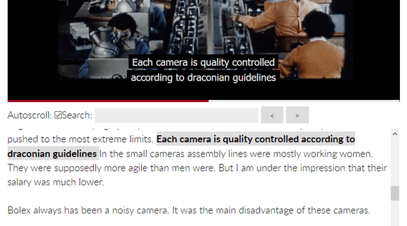
Interactive Transcript is one of the great features you will get with the Pro version of FV Player. It will use a VTT file to show a dynamic text transcript in a box below the video. The text will follow the video playback and highlight the current line. It will also allow viewers to skip to any point in the video by clicking on other lines in the transcript.
If your theme is wide enough (think no sidebars and 1200px width), it is possible to move the transcripts to the side of the video box. You will have to do these 3 steps:
1. Wrap the video shortcode with a DIV that uses a clearing class. Typically, all themes include a class called .clear or .clearfix. These are used whenever you want to wrap columns or floated elements so they don’t just hang around wherever they (or the browser) want.
Example:
2. Move the transcript to the side – now that we have it all wrapped, we can start moving, the video to the left and transcript to the right. You get best results if the width of your videos is set to 640px.
.flowplayer { float: left; width: 55%; }
.fv_fp_transcript_wrapper { float: right; width: 44%; }
p.fp-caption { display: block; float: none; max-width: 100%; }
After this addition to your theme’s stylesheet, it should look like this:

Video and transcript side by side
3. Bring it back for mobiles – transcript on the side will really work best only on desktops and large screens. For smaller devices we need to add some media queries, to bring them back under the video. You can either just copy this part of the code somewhere near the end of your stylesheet or incorporate it into your existing media queries, if you know HTML well enough.
@media only screen and (max-width: 64em) {
.flowplayer, .fv_fp_transcript_wrapper { float: none; width: 100%; }
}
Chapters
Editing .VTT chapters titles
You can adjust the titles of .VTT chapters via CSS. Here’s how:
This part hides the time values and “:” :
.fv_fp_chapter,
.fv_fp_chapter + span {
display: none;
}
This part underlines the chapter titles:
.fv_fp_chapters li {
color: #800;
text-decoration: underline;
}
This part sets the hover effect:
.fv_fp_chapters li:hover {
color: black;
font-weight: bold;
}
Show chapters menu in controlbar
Normally the menu can only be seen in fullscreen and you have to use the list of chapters below the video.
.flowplayer .fp-controls .fv-fp-chapter {
  display: block;
}
Center chapters below the player
Normally the chapters appear aligned to the left and with bullets.
.fv_fp_chapters li {
  list-style-type: none !important;
  text-align: center;
}
Put chapters into more columns
Normally the chapters appear in a single column. You can add any number of columns. This trick creates two columns:
@media all and (min-width: 500px) {
  .fv_fp_chapters {
    columns: 100px 2
  }
}
Add text before the chapters
You may want to add a custom name to the chapters, or include instructions on how to use chapters. This will let you add custom text above chapters:
.fv_fp_chapters:before {
  content: 'Video Chapters';
  margin-left: -24px;
}
Move chapters from below the player to the right hand side
Here’s some CSS to make this happen on wider displays:
@media all and (min-width: 500px) {
  .flowplayer.have-chapters {
    width: 66%;
    margin-right: 1%;
    float: left;
  }
  .fv_fp_chapters {
    width: 32%;
    float: left;
  }
}
Overlay Ads
Position the overlay content
By default it shows above the control bar and centered. Here’s a code to set the dimension and put it to top right:
.wpfp_custom_ad {
  width: 100px;
  top: 0;
  right: 0;
}
Customizing the Close Button in Overlay Ads
The free version of FV Player allows users to set the overlay ads – the classic banner pop-ups that appear during the video playback. These can be created from scratch, showing just a link or a custom call-to-action button, or you can use ad code from services such as Google AdSense. You can read more about the overlay ads in the guide Overlay Ads in FV Player.
Some of our users have expressed the need for customizing the closing button, that appears in the top-right corner of all overlay ads. That can be easily done via CSS and there are a couple of properties, that can be changed. This is the selector used for editing the close ad button:
.fv_fp_close a {
    width: 22px;
    height: 22px;
    background: url(//my-close-ad-button.png) no-repeat;
    background-size: 22px 22px;
}
The width and height properties define the size of the clickable field and the background-size defines the size of the “x” icon itself – therefore they should be the same size.
If you want to replace the icon with your own, you can use the background: url property (don’t forget to also add the no-repeat; property). With custom dimensions and background image, the close button can look for instance like this:

Customized Close Ad Button
Making the player left-aligned by default with text appearing below it
Although we have a post in our demo section dedicated to player positioning and alignment, some users also wanted a quick CSS reference on how to align our player to the left with no text wrapping around it.
.flowplayer {
    margin: 0 0 2.8em;
}
Video Ads
The custom video ads feature available for the FV Player Pro users comes with a text that informs the viewer about the time that remains until the ad can be skipped. The time can be set manually in the player’s settings and after the countdown finishes, the Skip button will appear and let the viewers skip the ad.
Some of our users were asking about how to modify this text, so here are some possibilities.
CHANGING THE SKIP BUTTON COLOR
If you want to modify the color of the text, you can do so by adding this CSS code to your template’s style sheet:
#content .flowplayer a.fv-cva-skip, .flowplayer a.fv-cva-skip,
#content .flowplayer a.fv-cva-skip .fv-fp-nextbtn, .flowplayer a.fv-cva-skip .fv-fp-nextbtn,
#content .flowplayer a.fv-cva-skip .remaining, .flowplayer a.fv-cva-skip .remaining {
  color: red;
}
Hiding the Skip Button
You can hide the text entirely, disabling the ability to skip for the viewers. For the message to no longer display, just add this CSS code:
.flowplayer.is-cva .fv-cva-time {
  background: rgba(0,0,0,.4);
}
FV Player Pay Per View
Center the video overlay buy buttons verically
.flowplayer .wpfp_custom_popup {
  display: table;
  height: calc( 100% - 2.8em );
}
.flowplayer.is-ready.is-paused .fv-player-ppv-purchase-btn-wrapper,
.flowplayer.is-finishsed .fv-player-ppv-purchase-btn-wrapper,
.flowplayer.is-ppv-lock-active .fv-player-ppv-purchase-btn-wrapper {
  display: table-cell !important;
  vertical-align: middle;
}
Hide controlbar in splash state
Normally the preview video shows with the full video duration in the controlbar before playing. You can use this to hide the controlbar.
Or you can remove the .is-splash part to always hide it for the preview videos.
.flowplayer .flowplayer.is-splash[data-popup*="ppv"] .fp-controls {
  display: none;
}
Invoice Watch button color
The button uses .button class to give it the button styling provided by your theme. For the Easy Digital Downloads version of FV Player Pay Per View you need to use this CSS to target the Watch button precisely and adjust the properties as needed:
.edd_purchase_receipt_files a.fv-player-ppv-watch {
    background: #88f;
    color: white;
}
If you use the WooCommerce version of FV Player Pay Per View you need to use some more classes:
.woocommerce a.fv-player-ppv-watch.button {
    background: #88f;
    color: white;
}
Removing buy buttons below the video
Normally the buy buttons appear on top of the preview video once it ends or when it’s paused, but also below the video (see Pay Per View demo page). You can hide these using:
.fv-player-ppv-wrap .edd_download_purchase_form {
  display: none;
}
