Building mobile versions of websites was an arcane art for a couple of years. And not all that necessary as only a minority of people had smart phones and even fewer of them were using them to actively browse the web. Over the last year as the devices get better and better, more and more visitors are using their smart phones to visit websites.
If you don’t already have a mobile version of your site, it’s time to put one in right now. Here’s how you do it, from A to Z. If the beginning seems a bit complicated, just push ahead. There’s an easy point form summary at the bottom of the article.
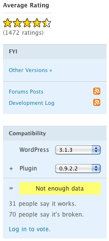
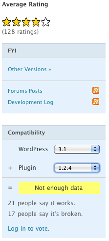
If you have even a reasonably busy WordPress site, you need to have a caching solution in place. Without caching, you’ll get your site kicked off shared hosting lickety-split or you’ll cripple performance on your VPS. Visitors like fast sites and cached sites are two to five times faster than uncached sites. For WordPress, there are three major choices in caching solutions: WP Super Cache, W3 Total Cache and Hyper Cache.
For a mobile site, you need to have a caching solution which will pass through mobile clients quickly and reliably to your mobile version.
Of the three above, by far the most reliable is WP Super Cache. Donncha O Caoimh has been providing reliable code (and an almost unspellable name) for five years now. (Donate here. We did.)
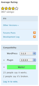
WP Super Cache mostly works.
A real work horse, Super
Cachejust keeps on ticking


Sometimes high performance,
always high maintenance, deploying
W3 Total Cache is like taking the
space shuttle to the grocery store

Hyper Cache seems to work
the new kid on the block,
showing promise. We’ve
had issues with Hyper Cache
on some of our bare bones
Debian server.

Start by making sure your caching plugin is properly set up. These settings are not the default but are where you want to be. Donncha includes the most compatible and much slower defaults in his plugin (good idea, as new WP users can get some benefits with little risk). Here are Donncha’s main instructions to get WP Super Cache to really fly and to reduce your load times for Google (good for SEO):
- Mod_Rewrite. The fastest method is by using Apache mod_rewrite (or whatever similar module your web server supports) to serve “supercached” static html files. This completely bypasses PHP and is extremely quick. If your server is hit by a deluge of traffic it is more likely to cope as the requests are “lighter”.
- If you are not using legacy mode caching consider deleting the contents of the “Rejected User Agents” text box and allow search engines to create supercache static files.
- Likewise, preload as many posts as you can and enable “Preload Mode”. Garbage collection will still occur but it won’t affect the preloaded files. If you don’t care about sidebar widgets updating often set the preload interval to 2880 minutes (2 days) so all your posts aren’t recached very often.
Now it’s time to get ready to set up the mobile version. First you need to make a choice on building your own mobile solution or starting with a mobile plugin. We recommend using a plugin as starting from scratch is a lot of busy work. There’s really not all that much room 320 x 240 pixels for creativity (the exception proves the rule guys) so you may as well set up something attractive and standard and business-like. There are a couple of good plugins out there to give you a running start.
Free and slightly unreliable: WP Mobile Pack.

WP Mobile Pack works or broken
Paid and very good but with some issues outside of Apple’s i-universe: WP Touch Pro. Here’s a WP Touch Pro feature chart (there is/was a free version as well).
You’ll want a full list of user agents for which you will serve the mobile version. Next, make sure the list of user agents match in both your mobile plugin and in your cache plugin.
Here’s a list to match WP Super Cache’s list of mobile user agents which you can copy and paste into the user agent theme preferences in WP Touch Pro.
MMP
240x320
400X240
AvantGo
BlackBerry
Blazer
Cellphone
Danger
DoCoMo
Elaine/3.0
EudoraWeb
Googlebot-Mobile
hiptop
IEMobile
KYOCERA/WX310K
LG/U990
MIDP-2.
MMEF20
MOT-V
NetFront
Newt
Nintendo Wii
Nitro
Nokia
Opera Mini
Opera Mobi
Palm
PlayStation Portable
portalmmm
Proxinet
ProxiNet
SHARP-TQ-GX10
SHG-i900
Small
SonyEricsson
Symbian OS
SymbianOS
TS21i-10
UP.Browser
UP.Link
webOS
Windows CE
WinWAP
YahooSeeker/M1A1-R2D2
iPhone
iPod
Android
BlackBerry9530
LG-TU915 Obigo
LGE VX
webOS
Nokia5800
iPhone
iPod
incognito
webmate
Android
dream
CUPCAKE
froyo
BlackBerry9500
BlackBerry9520
BlackBerry9530
BlackBerry9550
BlackBerry 9800
BlackBerry 9780
webOS
s8000
bada
IEMobile/7.0
Googlebot-Mobile
This list doesn’t include the WP Super Cache substrings as they are too short and dangerous to use in WP Touch Pro as WP Touch Pro matches substrings throughout the user agent, while WP Super Cache matches substrings against just the beginning of the user agent. Pasting the full list of substrings into WP Touch Pro makes full Safari and Opera display mobile versions (they match on “tosh”). We’ll keep working on a better version of mobile agents for WP Touch Pro and post it here.
If there’s a problem, all that will happen is that mobile user will get the standard site uncached.
If you use Hyper Cache – enable “Detect mobile devices” and add following into “Mobile agent list” option:
googlebot-mobile Mobile Safari
To enable WPTouch and WPTouch Pro theme switching put following strings into Fitlers -> “Cookies matching”:
wptouch-pro-view wptouch_switch_toggle
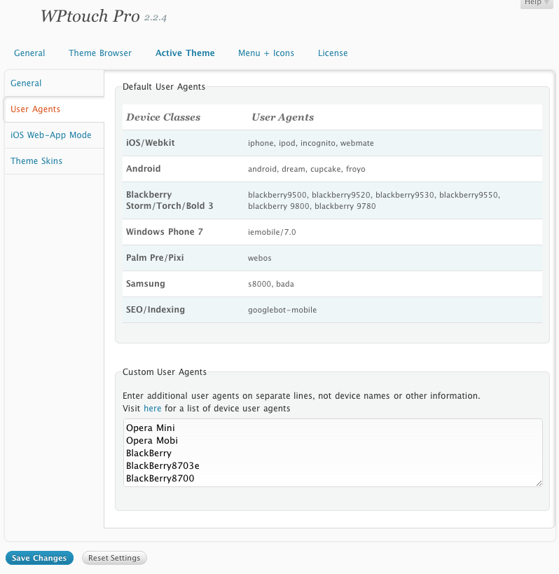
Here’s the WP Touch Pro theme preferences where you should paste the user agents above:

WP Touch Pro user agents
There’s some discussion about whether to give a full site or the mobile site to an underpowered device which can’t really handle the full WP Touch experience.
In principle these weak web browsers like Opera Mini 4 have special mobile modes to deal with standard sites, doing the reformatting themselves. But the reformatting will be easier if they are starting from WP Touch’s advanced mobile version.
The difference won’t be that great.
Here are some screenshots of WP Touch Pro iPhone version and Opera Mini minified version.

Opera Mini WP Touch Pro version
Not bad for a start if a bit too wide


Opera Mini WP Touch Pro filtered mobile
that’s more like it and includes site colours

The minified version of the normal website through Opera’s built-in mobile proxy is not much worse but the navigation (not shown) is much more difficult. And you have to rely on the end user to turn on minified versions. Relying on the end user is a fool’s game.

Opera Mini full site Opera mobile proxy filter

WP Super Cache handles mobile settings a bit differently than W3 Total Cache and Hyper Cache. WP Super Cache doesn’t let you hand in a list of mobile devices but generates it itself and puts it in .htaccess along with the basic rewrite rules. Here’s what the list looks like:
RewriteCond %{HTTP:X-Wap-Profile} !^[a-z0-9\"]+ [NC] RewriteCond %{HTTP:Profile} !^[a-z0-9\"]+ [NC] RewriteCond %{HTTP_USER_AGENT} !^.*(2.0\ MMP|240x320|400X240|AvantGo|BlackBerry|Blazer|Cellphone|Danger|DoCoMo|Elaine/3.0|EudoraWeb|Googlebot-Mobile|hiptop|IEMobile|KYOCERA/WX310K|LG/U990|MIDP-2.|MMEF20|MOT-V|NetFront|Newt|Nintendo\ Wii|Nitro|Nokia|Opera\ Mini|Palm|PlayStation\ Portable|portalmmm|Proxinet|ProxiNet|SHARP-TQ-GX10|SHG-i900|Small|SonyEricsson|Symbian\ OS|SymbianOS|TS21i-10|UP.Browser|UP.Link|webOS|Windows\ CE|WinWAP|YahooSeeker/M1A1-R2D2|iPhone|iPod|Android|BlackBerry9530|LG-TU915\ Obigo|LGE\ VX|webOS|Nokia5800|iPhone|iPod|incognito|webmate|Android|dream|CUPCAKE|froyo|BlackBerry9500|BlackBerry9520|BlackBerry9530|BlackBerry9550|BlackBerry\ 9800|BlackBerry\ 9780|webOS|s8000|bada|IEMobile/7.0|Googlebot-Mobile).* [NC] RewriteCond %{HTTP_user_agent} !^(w3c\ |w3c-|acs-|alav|alca|amoi|audi|avan|benq|bird|blac|blaz|brew|cell|cldc|cmd-|dang|doco|eric|hipt|htc_|inno|ipaq|ipod|jigs|kddi|keji|leno|lg-c|lg-d|lg-g|lge-|lg/u|maui|maxo|midp|mits|mmef|mobi|mot-|moto|mwbp|nec-|newt|noki|palm|pana|pant|phil|play|port|prox|qwap|sage|sams|sany|sch-|sec-|send|seri|sgh-|shar|sie-|siem|smal|smar|sony|sph-|symb|t-mo|teli|tim-|tosh|tsm-|upg1|upsi|vk-v|voda|wap-|wapa|wapi|wapp|wapr|webc|winw|winw|xda\ |xda-).* [NC]
The advantage of this system is that it makes bypassing normal processing ultrafast (the movement happens at an OS level, rather than on invoking PHP).
It also means you as the end user don’t get to fiddle endlessly with what devices to include. You’ll have to count on Donna to choose the right ones.
Which it seems he does.
As you can see, it’s very complete, including iPhones, Androids, Palm, Blackberrys, Palms, Nokias, Symbian.
On the other end though, if you are using WP Touch Pro, you’ll have to give it a list of devices. Look out for versions under 2.2. The Skeleton template 1.0.8.1 does not handle blackberrys very well. Skeleton Template 1.2 definitely does, so if you’re having trouble, make sure to upgrade WP Touch Pro to the latest version and then update your template.
Both Hyper Cache and WP Super Cache have built in compatibility with WordPress Mobile Pack. If you haven’t already jumped on the WP Touch Pro bandwagon, WP Mobile Pack might be worth a try as it’s already fully integrated to two of the top cache plugins and free. Unfortunately, WPMP appears to have some compatibility issues and is not kept up to date. You’ll have to do some digging of your own to get it to work properly.
Once you are up and running, you’ll want to test your settings. Here are the easy tests. Opera has a desktop emulator for their advanced mobile browser and an online java version for Opera Mini.
http://www.opera.com/mobile/demo/
http://dev.opera.com/articles/view/opera-mobile-emulator/
Test for iPhone with Safari by enabling the developer menu and then reassigning user agent. On a Mac, I recommend Keyboard Maestro to set up a hot key on the menu command (usually application menu items can also be done in keyboard section but it’s a bit trickier). I’ve assigned command-U and it really speeds up testing for different user agents. You can also then use Safari to test for Blackberry user agents and other exotica.
Ideally you’d have at least a few real mobile devices with which to doublecheck your site. An iPod Touch is a great inexpensive stand-in for an iPhone/iOS. Opera Mini will install into most devices in parallel with the main browser. Make sure to navigate around to be sure everything is working.
When you know that your mobile versions are making it through you’ll want to sit down and have a think about what someone visiting your site on a mobile browser would want to see (insurance calculator, mortgage calculator, listings search, catalogue or weblog posts) and put those front and center. You might even want to remove large sections of your site which won’t display well on a mobile device from mobile navigation.
With multiple mobile device formats (think iPad), WP Touch Pro has alternately display models which it handles internally.
So to recap here are the steps.
How to Quickly Build a Great Mobile Version of Your Site
- Put together a list of user agents which you would like to show a mobile version (the longer the merrier, there’s no sense in being parsimonious here).
- Set up your cache plugin not to pass through mobile devices (not to show cached full pages). Recommendation: WP Super Cache which comes with baked in list.
- Set up your mobile plugin to serve a mobile version to those same user agents (if you miss a few, no worries). WP Touch Pro recommended.
- Check appearance with Safari in iPhone mode and with Opera Mini online emulator.
- Tweak appearance to match site colours.
- Tweak menu items to show what is important for mobile and hide what is irrelevant for mobile or will not display well.
- Remove mobile plugin branding (branding on commercial plugins/themes is obnoxious: are you listening Brave New Code?).
- Add a large 512 pixel icon for people who bookmark, create automatic apps in Safari. (WP Touch Pro feature).
- Test that mobile versions are being served up to the principal user agents and browsers with Safari.
- Test on whatever real devices you do have.
- Send your client to visit the site on his or her mobile device (remember what I said about adding Blackberry user agents: this is the moment of truth, an astonishing number of clients will have Blackberrys).
- Prepare to do this for all the rest of your clients.
Every site should have a mobile version now. WP Super Cache and WP Touch Pro make it very easy for developers to provide high quality mobile versions at an affordable price. There’s no excuse not to offer clients an affordable mobile version of their site.

Alec Kinnear
Alec has been helping businesses succeed online since 2000. Alec is an SEM expert with a background in advertising, as a former Head of Television for Grey Moscow and Senior Television Producer for Bates, Saatchi and Saatchi Russia.
Leave a Reply