Mehmet Gözetlik is a Turkish designer who has published a number of thought provoking articles on minimalist packaging, More minimalist effect in the maximalist market!. One of his more obscure essays covers the Togg rebranding. If you don’t know who Togg is, join the club. Togg is a Turkish automobile manufacturer whose ambitions include cracking the European and international car market. Recently they rebranded, unsuccessfully according to Gözetlik.
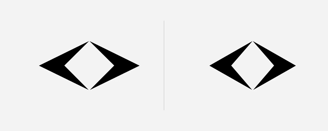
Togg’s new symbol are two distorted diamonds facing each other. The issue is that an Android app got there first. Toggs is on the left, Faces app is on the right.

Toggs logo | Faces logo
What’s really worrying here is that the Faces logo looks much better. The Togg version of the shape looks distorted, squashed beside it. On its own the Togg logo bothered the eyes, next to Faces logo one sees exactly why.
Learn how how branding can slow down a company with a good product and big ambitions (a bad product can’t be saved by great branding and a great product can’t ruined by mediocre branding).
For those Turkish nationalists who argue Gözetlik preys on the weak by attacking his native competitors in design, read what he has to say about Audi’s rebranding.

Alec Kinnear
Alec has been helping businesses succeed online since 2000. Alec is an SEM expert with a background in advertising, as a former Head of Television for Grey Moscow and Senior Television Producer for Bates, Saatchi and Saatchi Russia.
Leave a Reply