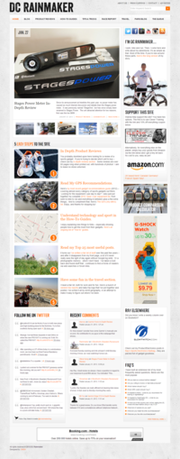
DC Rainmaker – New design
During the day, the owner of DC Rainmaker, Ray Maker, designs computer networks and systems, and in his free time, he blogs about being a triathlete. Years of consistent blogging and high-quality content paid off, and dcrainmaker.com has become an immensely popular website with hundreds of widely-read posts and a high number of visitors. For many, Ray’s blog is the number one place to go if they need a good advice and a detailed review of running, swimming or biking equipment before purchasing it.
Due to Ray starting on Blogger, he was severely limited in the features he could add to his site. Blogger had become the limiting factor to the improvement of DC Rainmaker but Ray didn’t want to lose years of slowly built Google rankings.
With his background in IT, Ray knew that his site urgently needed a redesign and that the migration would not be a simple matter. Ray first contacted talented designer Heather Sanders of OMSH, and asked for her help. The envisioned changes were not only related to design, the website needed careful restructuring and migration.
Heather asked Foliovision to take over the migration and technical work.
I have worked with Foliovision long enough to know they are more than capable of handling the complexity of my designs as well as the extended needs of many of my clients.
Heather worked with Ray on strategy and design, and it was up to Foliovision to take care of the Blogger to WordPress SEO Move, custom programming and complete web development.

Heather Sanders, designer OMSH
It was very important for Ray to launch the new website before Thanksgiving, giving both Heather and Foliovision just a little over a week to complete the entire project. Normally a project like this would have a six week design and development schedule.
Fortunately Ray had a very clear vision. To meet the tight schedule, Foliovision started on the first step, the technical move from Blogger to WordPress right away, while the rest of the website was developed exactly according to the client’s ideas. He pointed out what he liked and disliked on other websites, including those, which Heather has designed herself. Ray knew precisely what he wanted to change on the website, and as he has a technical background, he also knew how to explain his ideas. Ray’s almost instant answers to the development team made the almost impossible schedule much easier for both the designer and the programmers.
Foliovision creative director Alec Kinnear liked the challenge and Ray’s site:
Both lead programmer Martin and I are keen distance athletes, so we felt a natural affinity with what Ray is doing. We were able to quickly work out how to best import and organise the sports device data into a simple powerful searchable database. With Heather, we knew we could count on a very clear and precise design to allow us to move so quickly with the development.

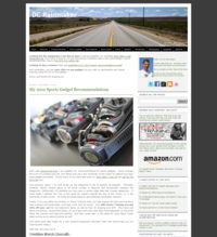
DC Rainmaker – Old Blogger site
The key requirements of the client were to have a professional, clean and easily navigated site. Heather worked with this information and designed the new DC Rainmaker accordingly. As she does not work within pre-existing WordPress themes, Heather custom designed the entire site by herself, working only with the ideas of the client, the websites that he liked, and her creativity. In Heather’s words,
the greatest challenge was finding a way to aesthetically manage and organise the rich content in a way that would allow visitors to navigate the site easily, see everything it has to offer, and at the same time, not feel overwhelmed.
The client was very keen on using big pictures to achieve a more spacious look and avoid crowding. As the visitors to Ray’s site are usually technically oriented themselves, they have the latest and greatest hardware including widescreen monitors. This allowed Heather to opt for a non-standard larger width. For CSS designer Viktor it was hence clear that the website needed responsive design, otherwise its visitors would have to put up with inconvenient horizontal scrolling. Viktor was able to make DC Rainmaker work with both standard and the widescreen versions of the website, looking good on monitors of almost every size.
The look of the new website indeed is a bit step forward aesthetically. Navigation is easier and many features are now automated, saving Ray a lot of time when posting advanced comparisons of hardware and offering visitors a richer experience. The single largest improvement in the new DC Rainmaker is the Product Comparison Calculator. As programmer Martin pointed out, the older version of the calculator was a product comparison chart, which was only a screen-shot of an Excel table. That required a lot of work, and it was not very practical – it became outdated with every new product on the market. Now instead of a huge Excel table, all the data (about 3,000 pieces and growing) from reviews is stored in a backend database, and website visitors can easily customize their choice of products to compare by just a few button clicks.
The process is simple – visitors first have to choose what type of device they are looking for (Swim, Bike, Run, Tri, Hike), and possibly a price range (Budget, Moderate, High-End). Once a selection is made, suitable units are highlighted (it is possible to add others or delete some of the highlighted ones), and a table containing detailed info about each of the highlighted products is displayed below, allowing visitors to compare the products easily and thoroughly. The calculator makes it easy for the readers to refine their comparisons, by simply clicking on specific products or categories.
The comparison charts are also included in the most crucial part of the website for many of its visitors, the reviews. In reviews, they are now automatically based on products of a certain category. That means, if one is reading a review of a watch, the chart contains info about hundreds of other watches, including more recent ones. Unlike on the old website, the reviews are very well organized on the new website. They are now clearly separated in categories. Readers can thus navigate to specific products more easily, even according to features like manufacturer and release date of product. Those, who always eagerly wait for a new product review certainly appreciate The Queue, where pictures, screen-shots and brief information about new products are posted before a long and detailed review. Thanks to The Queue, readers know what reviews they can look forward to.
The FAQ widget built into the sidebar is also an innovation. Yet another improvement worth a mention is the Press Clippings page. Even though blogging is not Ray’s full time job, his website is very well known among thousands of fans of running, biking, and/or swimming. It is not surprising that it gets mentioned in the media from time to time. All the mentions of Ray or his website in the press are stored in the section.
Dcrainmaker.com has been a popular website for a long time, and since the launch of the new site on 20 November 2012, its popularity has increased even more. First, its visibility in search engines has improved, according to data available from Google Webmaster tools. The average number of both impressions (that is, the number of times when the link dcrainmaker.com was displayed in Google when someone searched for a keyword or a phrase) and clicks ( that is, the number of times when someone searching for a particular keyword on Google clicked the link dcrainmaker.com) went up since the new website has been launched.

DC Rainmaker Impressions and Clicks Graph
The daily average number of impressions was 73,226 in the month the website was moved, in November 2012, and it has been going up since. In December, this number rose to 94,032 and during the first 27 days of January, the average number has been 114,444 (data for the whole month of January is not available yet).The rise recorded in clicks it is not very well visible in the graph, due to lower scale, but it is obvious when looking at exact numbers. In November, the daily average number of clicks was 4,823. That went up to 5,645 in December 2012, and the increase continued to 6,870 in January (again, this was 4 days before the end of the month, the final January data is not available yet).

DC Rainmaker Pageloads Statistics
Not only the visibility of the website in search engines has improved since the move. The average monthly number of visitors and pageloads increased as well. During the last full month of the old Blogger website, October 2012, DC Rainmaker recorded 742,195 page-loads, and 175,231 website visits. In November 2012, pageloads went up to 868,493; and website visits rose to 195,946. The first full month of the new website was even more successful . Amazing 1,054,352 pageloads, and 234,573 website visits were recorded. The great December numbers might partly be contributed to the Christmas period – those shopping for presents could have visited the website to read reviews about the products. However, January 2013 was not worse than December, quite the contrary. It is clear even from the incomplete data (until 27th January) that the numbers of pageloads and website visits were record high during the month – they have gone up to 1,059,968 and 240,334 respectively.
The new website is a great success. Despite the distance (Foliovision is in Bratislava, Heather is in Texas, and Ray is in Paris), the Blogger to WordPress move, custom programming and design were finished in just a few working days. The rankings of the website went up, it is significantly more automatic, open and clean, and it is also easier to navigate. In Heather’s words, the new DC Rainmaker truly represents what Ray imagined. She is “proud to have delivered a website true to the client’s vision and it was a great pleasure working with Ray”.
Heather was kind enough to give Foliovision’s work “a round of applause” as well. It is a wonderful feeling to have been able to delight both one of the top web designers and one of the top fitness experts in the world in one project.

Alec Kinnear
Alec has been helping businesses succeed online since 2000. Alec is an SEM expert with a background in advertising, as a former Head of Television for Grey Moscow and Senior Television Producer for Bates, Saatchi and Saatchi Russia.


Leave a Reply