First impressions are what counts when it comes to any aspect of online marketing. If you don’t catch user’s attention the first second they come across your post, that’s it. You don’t get a second chance. That’s why it is so important to make your content visually attractive – whether it is a blog post, a podcast (yes, even a podcast) or a video.
Now, videos are very specific, since they already are a type of visual content, but unless you’re running ads on TV or Youtube, the first thing people are going to see when they come across your video is the image that presents what the video will be about, also known as the splash screen.
There are many types of splash screens you can choose for your video, depending on the topic. But the most important thing is not to leave it to chance and just use the automatically generated splash screen. Facebook, Youtube and Vimeo all offer automatically generated splash screens. That’s fine if you’re in a hurry to post your video and the generated images actually look good. But it also means that often you’ll come across real estate video tours with an image of a toilet as the splash screen.
Since people judge both articles and videos by the images they first see, and if they don’t like your splash screen, they won’t play your video. So you should always customize and pick something easily recognizable.
I’ve chosen a couple of vloggers/video makers I think are good examples of how to use custom splash screens to your advantage.
Vlogging
If you’re a vlogger, people are probably used to seeing your face in the video, so make sure to include it in the splash screen.
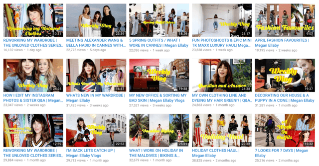
As an example, let’s take Megan Ellaby, fashion blogger/vlogger from Manchester. Her video thumbnails are very easily recognizable and it is becasue she’s consistent. It’s always Megan you see in the image and she uses the same fun yellow font as a part of her brand. When it comes to any kind of online content or online promotion, consistency is the key, if you want to be successful.
Video Lessons
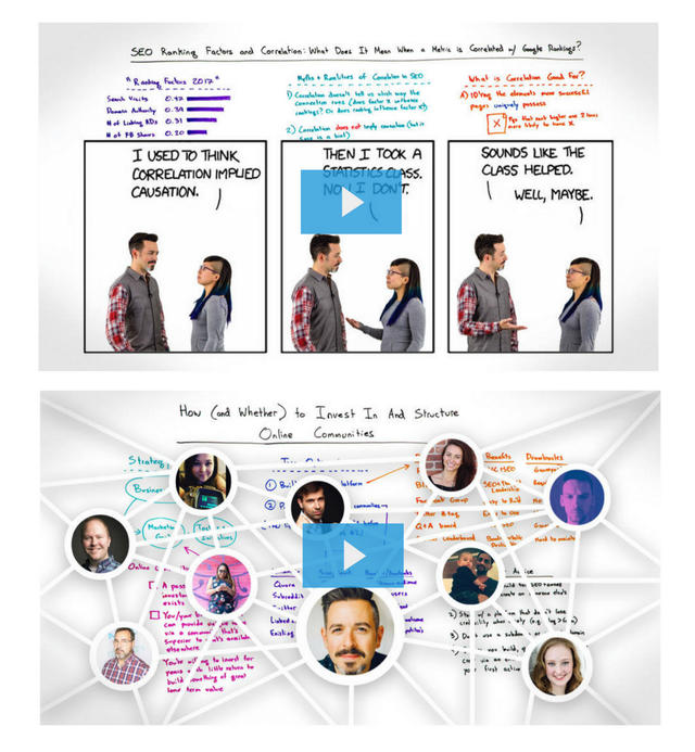
If you post online video lessons of any kind, you might want to include some text in your splash screens as well. If you’re seen in the video, definitely take a screenshot and add the text afterwards. A good example would be Rand Fishkin and the Whiteboard Fridays videos he used to do at Moz. He left Moz a couple of months ago to form his own startup called SparkToro, but they’re continuing to post Whiteboard Friday articles and videos in the same way.
Fishkin’s splash screens always show a whiteboard and in most of them, he’s standing in front of the white board – making both him and the Whiteboard Fridays easily recognizable at first glance.
High-definition travel and nature videos
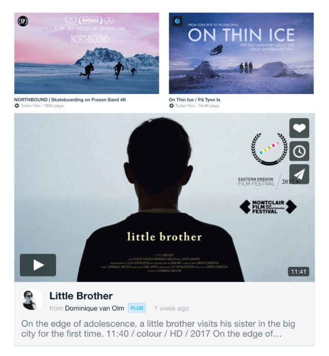
Each week we choose a video to feature on our blog. We focus on exquisite cinematography, captivating stories or images. To find the videos, we have to go through number of films whether on Vimeo or Youtube. If our topic for the week is timelapses, or nature films of some kind, I find I’m more likely to play the video if it has 4K in the thumbnail or in its name. That also applies to videos that lists their awards in the splash screen as well. It makes them more interesting and it separates them from the rest of the videos in the search results. However, that doesn’t mean that you shouldn’t also choose a captivating image to go with your text.
Low-res videos
If you have a low resolution video filmed on your front-facing phone camera, it won’t do you any good to try and create a beautiful HD splash screen image. Don’t try to trick people. You might think it will attract more people to watch it, and it probably will, but at the same time once people actually play your video, the big difference in quality will make them leave instantly. Instead, find a good, interesting or funny shot from the video, take a screenshot and use it as your splash screen.
For example, Eva Kramerová, also known as Evelyn, is a Slovak comedian, who posts funny videos in which she’s playing Gitka, a “typical” Eastern Slovakian woman finding herself in a number of strange situations which she then describes to her friend on the phone. The videos are filmed on a front-facing phone camera and Evelyn doesn’t bother much with the splash screens. In her case, her fans know exactly what to expect from these videos and they’re a part of her brand, so the Youtube generated automated splash screens are a good choice.
However, if you’re serious about videos, and you’re not a comedian like Evelyn, you should strive to improve their quality. We have the technology, so don’t be lazy and just learn how to use it to your advantage.
Great tools to create high-quality splash-screens
Once you’ve decided what kind of a splash screen you want, you’ll need some tools to prepare it. Here are the ones I use.
iMovie
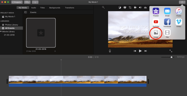
If you want a screenshot of your video, you should export the image you want straight from the video editing software you’re using. I usually use iMovie, because I do very basic video editing, but it’s very easy to export good images for your videos and the quality is much better than just taking screenshots of the video.
Once you’ve chosen the frame you want to use as your splashscreen image, click on export as image and voilà, you got your splash screen – whether it’s just the image that you’ll add some text onto or a final image.
I haven’t worked with Windows in a while, but Movavi looks like a good alternative to iMovie. If any of you Windows users has a suggestion, please let us know in the comments!
Canva
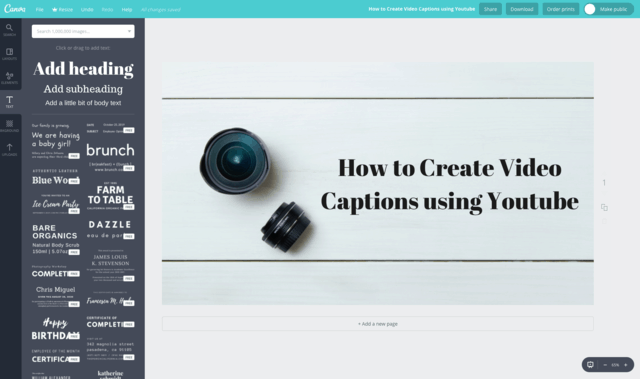
There are plenty of tools you can use to edit your image and add text. I recommend using Canva. Their free version is really powerful and I haven’t found a reason yet to even think about upgrading.
Start by creating a new design and choose the right dimensions depending on your video. Then just add your video screenshot and some text to it. Just make sure the font is easily readable and to use the same font for each of your splash screens.
Tips on creating your own custom splash screen:
- Make it recognizable
- Don’t overcomplicate
- The text should be easy to read
- Size it properly – the standard is 1280px720 or 1920×1080
- Make sure your cover looks good when sized down, so zoom out to test it while working on your image.
FV Player gives you the option to set default splash screen or to upload custom video covers as well for a chosen video. If your videos are hosted on Vimeo or Youtube, FV Player will automatically pull the splash screen used on the platforms, but you can, of course again, replace them with your custom images.
SK00SK

Leave a Reply