Medium’s non-existent login
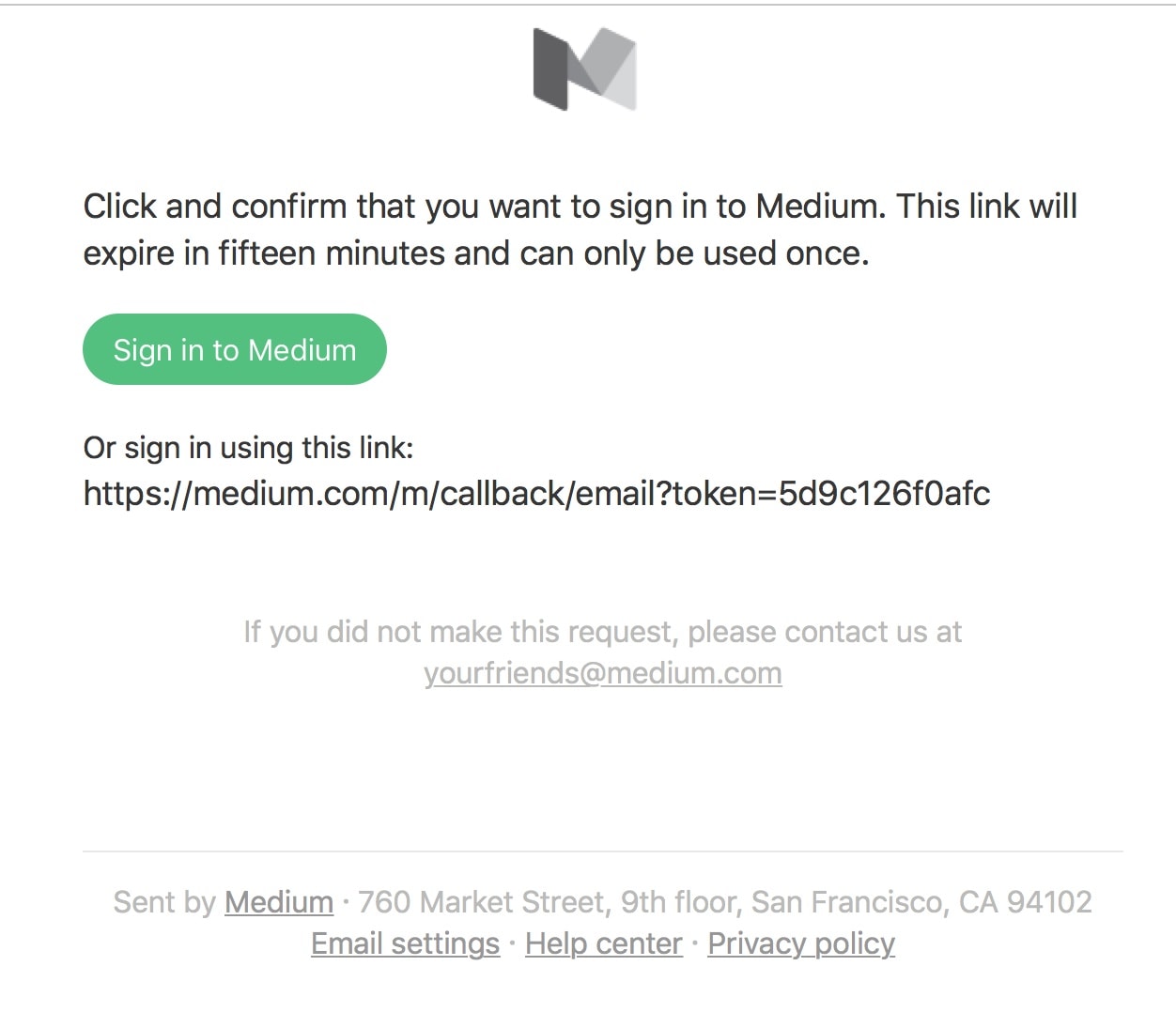
Let’s start with Medium Login. What user hating, social media centric tool ever dreamed up temporary sign in via email? If you want to log in to Medium via your email, you can’t do it with email and password. You have to send a new email to yourself (which takes somewhere between 30 seconds and two minutes to arrive) and click on the link within 15 minutes.
So instead of being able to fast track a response to a story I’ve opened up from Medium’s digest email to me, I’m bogged down in a cycle of five minutes of failed login (no login possible), email send, checking email for a login link (which sometimes doesn’t come). Could any process be less rewarding of engagement?
Insane.
Nested Comments
Medium’s idea of automatically allowing comments to become self-sufficient stories is extremely cool. The way it works is that when you start commenting, your comment becomes its own story that others can comment in. Something like nested comments into infinity.
So far so good. The issue is the number of clicks it takes to see comments let alone nested comments.
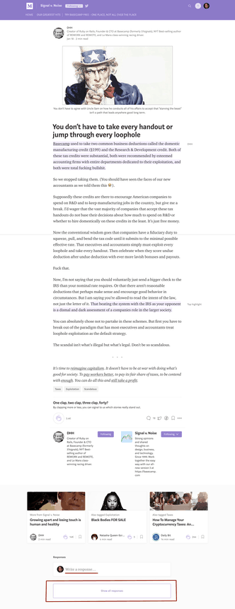
Example. When I start with DHH’s story “You don’t have to take every handout or jump through every loophole” I’m presented with a story with no comments underneath it. There’s an option to Write a response or to Show all responses. It’s absurd that I have to click now just to see comments. What happens later is worse though:
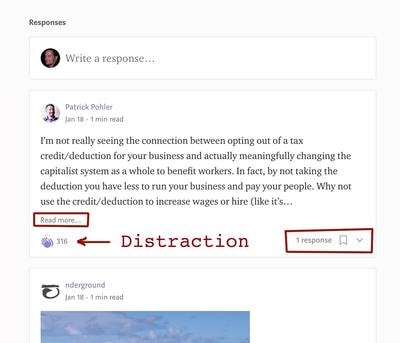
I’m shown half a comment. To see it all I have to click read more. I’m distracted by options to clap and a tally of existing responses. Clicking that number of responses strangely does not take me to the response but instead to the comment itself where the whole nightmare begins again with a Show All Responses button. I’ve just shown I’m interested in the responses.
So what’s my payoff for all this three clicks to see DHH’s response to a thoughtful comment?
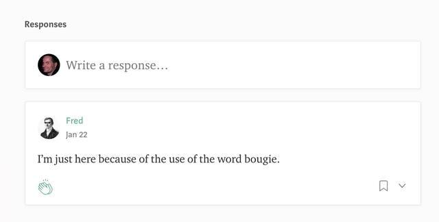
A stupid throwaway comment from a guy who thinks he’s funny. Is it worth chasing down comment threads on Medium? Based on this experience definitely not.
Page Impressions vs Usability
I’m not sure if Medium is running banners and living on page impressions. There’s at least three or four page impressions per nested comment which shouldn’t happen. Might be great for short term advertising revenue (if you advertise on Medium you should immediately ask for steep discounts as you are getting angry eyeballs who have no interest in your or any other products at this point) but it’s terrible for users. Medium started off by trying to be more usable, than say for instance, WordPress. To the point Matt Mullenweg started to have nightmares about Medium. In response, Mullenweg has decided to dynamite WordPress’s editor to try to emulate the Medium writing experience (Project Gutenberg).
Top Users
Medium was kind enough to send me congratulations on being one of the top contributors (stories and comments) of 2016. I didn’t win one of these awards in 2017 as I’ve grown exasperated with trying to read and comment on Medium.
What I do now is just read the story. Sometimes I’ll drop a top level comment. I’ll never reply to another commenter again (even though I’d like to). The Medium comment system is simply broken as it is.
Curiously enough, the number of my comments in 2017 was 10% higher than 2016 with similar read and engagement numbers. No congratulations.
Pattern of Medium use: Medium Subscription
But I’ve noticed that every time I start to engage deeper in Medium I become so frustrated within a few weeks that I disengage again. How many more frustrated would-be Medium contributors have been driven away by the incredibly poor community interaction (comment system)?
Medium would already have my money as a subscriber but I hate the idea of spending more time on Medium due to the horrors of the commenting system so my money is still in my pocket. So not only is Medium’s poor commenting workflow costing them engagement and content, it’s directly costing Medium money. Money Medium desperately needs.
How to fix Medium Commenting
It’s pretty simple. If Medium is really intent on keeping the stories clean without comment on first review, that’s liveable. But at the point where I hit “Show All Responses” I want to see those responses, at decent length (not half a paragraph or the first sixty words as now). That should include nested responses when I click read more.
A comment author should later have the option to upgrade a comment to a story with its own title (can then become “originally in response to”). But there’s no reason for every comment to be its own story. It’s a very utopian perspective (stories and comments are equal) which doesn’t correspond to human thought. An original story or essay is an block stone of content while a comment is exactly that – a direct response to the original work.
At the very least when I click through to the URL of the self-standing comment I should see not just the full comment but responses to it. It should probably be impossible to make a comment to a comment its own self-standing story. This would avoid the Russian boxes of comments and stories.
Sure there are some essays which offer far less than some comments. That is not a reason to equate the two. It’s more a reflection on poor writing or thinking of the weak essayist.
Across the internet, I have many comments which are worth building into an original essay. I plan to start doing so. Medium taking the individual pieces of what should become essays and equating them with a finished essay helps no-one, neither writer nor reader. There is no solution to the hard work of writing except time and hard work and a focused mind.
Conclusion and Competitors
It’s so incredibly frustrating to see new media creators come so close to creating a tool of lasting value and then fall down in sight of the finish line. It’s happened to both Tumblr and Del.icio.us. Not accidentally both Yahoo properties. How have some other platforms succeeded?
Medium vs Twitter
Twitter has gotten worse rather than better over time, more concerned with placating Democrat friends of its founder and the US Deep State than fostering open dialogue. There is a general retreat from Twitter as Twitter becomes a less reliable and neutral publishing partner.
Medium vs Facebook
Facebook has lasted this long as much as I loathe the national security aspect (a more complete database of the personal lives of the world’s population than the KGB had of dissidents in the Soviet Union), Facebook makes it easier and easier for users to share more and more. Facebook has been true to its platform and ease of use, albeit more or less ignoring privacy issues.
Facebook’s own involvement in censoring the news is creating some of the the same issues for Facebook as Twitter. As Facebook has a strong personal aspect, outside of a news republisher or promotional tool (unlike Twitter), censorship is less of an issue than Twitter.
Medium vs WordPress
WordPress is lost in its war with Wix and Squarespace to the point where Matt Mullenweg would like to raise more funding to spend it on advertising. He’s ignoring that the WordPress community was built on word-of-mouth. Making WordPress better (fewer updates, more stability, less security issues, more security, performance and functionality basics built-in). WordPress does allow a funded organisation to build a better weblog than Medium, albeit without the built-in community. Without fundamentally changing its character (one size fits all publishing), Medium should ignore WordPress and stick to what it does well: a no headaches weblog system. That means improving usability.
Medium should think less about page views and more about making it easy for its community to interact with each other’s stories. Hopefully Medium can go back to working for the long term benefit of its contributors sometime soon.

Alec Kinnear
Alec has been helping businesses succeed online since 2000. Alec is an SEM expert with a background in advertising, as a former Head of Television for Grey Moscow and Senior Television Producer for Bates, Saatchi and Saatchi Russia.
I used to read articles on Medium every morning, but I stopped going there so often recently exactly because of their complicated commenting system. I still like how easy it is to publish an article there and the clean and simple editing interface, but I don’t like that I don’t get to see the comments under each story, although I have to admit $5/month isn’t that expensive. I agree with you that each comment shouldn’t be a separate story. If someone wants to write an essay about the story they’ve read instead of leaving the comment, they should do that, but every single comment shouldn’t be a separate story.
Totally agree about the horrific comment system. There’s plenty of interesting content on Medium, and I’ve enjoyed many of the comments, but I’m just giving up. It’s like an example of what not to do with UX — just abysmally non-user-friendly.
Self-hosted wordpress is by far the best way to go for a blog, and wordpress is widely used as the standard solution for many full websites because of the huge variety of templates, themes and plugins that allow you to customize it any way you want. I’ve used wordpress almost exclusively for the last 7 years.
If you have a blog and you want to be legitimate, you need traffic. Traffic comes from search engines, which requires good SEO practices which is not personalized to your own brand and features with blogger, or wordpress.com hosted sites. Business (and money) comes from good branding which comes from traffic which comes from SEO which comes from good search engine rankings, it’s a simple as that
I absolutely hate Medium’s comment system, I’ve been on and off of medium every 6 months or so, just for a couple of weeks each time, remember the stupidity of the commenting system and then don’t read for another 6 months…. all your other points as well just lead to too much frustration. Its “so close” to being a really good site, but just not quite.
I’m late to the party here but this was the first link that showed up in google when I searched for “mediums commenting system is shit”. Sometimes its just good to vent somewhere where someone else recognized the shitness of something.
I was wondering why no one was raging about Medium’s commenting system. You listed all the reasons why the unnecessary hoop-jumping just to read a damn thread makes me hate reading Medium in general. How does anyone think this is good design???
Hi Ariel,
There’s a lot of content I like on Medium. As I like to comment, I try to avoid reading anything on Medium at all as the mechanics are so frustrating.
WordPress has decided to reinvent itself as a page builder instead of a CMS (insane), Medium won’t let you log in and comment without 10 minutes of jumping through hoops, Quora hides comments altogether (you can make them but no one can see them), Facebook now has the Atlantic Council running a full-on censorship and ban committee.
Our tech overlords have truly lost their minds. Time to burn them all down again. Just when we were doing so well with working technique. A pity Tim Berners-Lee had to live to see his brilliant invention turned to rubbish (I’m sure he doesn’t agree and is very happy to be among the living, what I mean is that it should have taken much longer for mischievous hands, marketers, government censors and the EU to destroy simple hyperlinks).
I like to use default comment system of wordpress, it works pretty good with the site with very less headache.
I like to comment on what I read, and this is very disheartening, not to be able to do so on Medium, without a lot of hassle that I can’t be bothered with. Such a shame. I’m going to cancel my paid subscription each month.
Vicki, I know exactly what you mean. I’ve stopped logging in to Medium and commenting completely due to the hassle. I’m no fan of how every comment is truncated now (to turn it into its own mini-article). I understand Medium would like readers to go to a comment to follow up with further comments. This kind of threading almost makes sense. However what doesn’t make sense is truncating comments so instead of reading a comment one has to open a new page for every single comment.
I hope Medium is taking it to the bank on page views as mine are much lower and my engagement with the site is almost nil at this point. I would be one of the more active participants there as my Disqus profile with about 2000 comments indicates (most of those are substantial, not simple driveby one liners).
Absolutely 100% agree. This × 100. Another aspect of Medium’s comment system that makes no sense is the fact that not all comment replies (comments about previous comments) are me to be replied to themselves, and there seems to be no rhyme or reason to how this is determined. Not overall thread depth, age, or even by internal “publication” grouping. It seems completely arbitrary. I am in my first (and sadly last) subscription due to Medium’s UI/UX.
Good news everyone! I’ve found the solution for a comments issue: medium.com/@ylukin277/how-i-resolved-comment-is-a-story-issue-on-medium-28ffb193bd90 Hope you’ll find it helpful!
I can no longer find a way to 1) check whether there are comments to my own comments, oh, and 2) respond to comments in the first place. It should be REALLY EASY given this is what generates engagement. I used to be able to do it a year ago on my iPad. What happened? Why did they want to decrease commenting? Discussion is what made the whole platform interesting.
I admit sometimes I google out of pure frustration, like the search box is my rant void. This was the top hit for “why are medium comments so hard to navigate so dumb” and it was so relieving to see I’m not alone in this observation. I was trying really hard to persist on a thread for a very complex topic as I want to see the diverse perspectives.
Unfortunately, that will not happen as I just can’t tolerate it.
A medium like a platform helps many people to work on an idea and develop it or evaluate it with others. I think platforms like this can generate more customers if you have the same agenda people are asking for. You need to answer their questions.