In 2016, Steven Dunn contacted Foliovision to help him with a Typepad to Wordpress migration and a redesign of his website OuiChefNetwork.com.
I volunteer with the No Kid Hungry organization teaching cooking classes to help people who aren’t as fortunate as I am and don’t have the skills I have. I teach them how to cook real food for their families, so they don’t rely strictly on takeout, hamburgers and pizza.
 OuiChefNetwork.com was created six years ago. Steve is a professional cook and he wanted to teach his children how to cook proper and healthy meals, which would also allow him to spend more time with them. So he started the website as a diary to collect his favourite memories of cooking with his children. (Here is one of his first posts about them making pizza together.) But soon enough, he realized that it has transformed into something else.
“It was not just about teaching my kids to cook, but to capture memories in a form that would be really just for myself,” said Steven. “But over time, the blog gained in popularity enough that I really began to dedicate more time to it, and I found that I enjoyed connecting with people from all around the world, who took interest in what we were cooking.”
It was then he realized that if he wanted to continue with the blog and please his readers, things would have to change. It’s one thing to write just for yourself, but to write for the whole online world interested in food, you need to master certain skills.
“I’m a cook by trade, but I don’t have a background in writing or photography, so a lot of it was about learning new things. How do you write for a wider audience? What do you need to know about styling food for food photography? How to make the website appealing to people?”
When Steven’s children left home, he decided to take some time off from blogging and when he decided to return to the online foodies world, he came back with a slightly different goal for his website and a very noble one, if we might add.
“I volunteer with the No Kid Hungry organization teaching cooking classes to help people who aren’t as fortunate as I am and don’t have the skills I have,” Steven told us. “I teach them how to cook real food for their families, so they don’t rely strictly on takeout, hamburgers and pizza.”
And that’s how OuiChefNetwork.com got a whole new meaning.
“When I was thinking about do I want to continue the blog, I thought ‘Okay, I’m not cooking with my kids anymore, but I want to cook things that encourage families to be in the kitchen and cook together’”, said Steven. “It was just me cooking things that would be approachable and would appeal to families cooking together, and people cooking for their kids.”

Steve volunteers with the No Kid Hungry organization
teaching cooking classes.
With this new goal in mind, Steven started to think about adding some new features to the website, to support the new type of content. But he realized that the Typepad platform was limited and not flexible enough for what he was trying to do. Which is why he decided to migrate his website to Wordpress and that’s how he found Foliovision:
“I’m not a technical person at all. So the idea of doing it myself was totally out of the question. So I was lucky enough to come across you guys in a Google Search and went from there.”
Foliovision migrated Steve’s website from Typepad to Wordpress and created a fresh new look to go with it.
The Design
I wanted something that was much simpler so that my food could be the star. I wanted something a little more elegant and easy to navigate, but to still have some functionality in recipe searching.
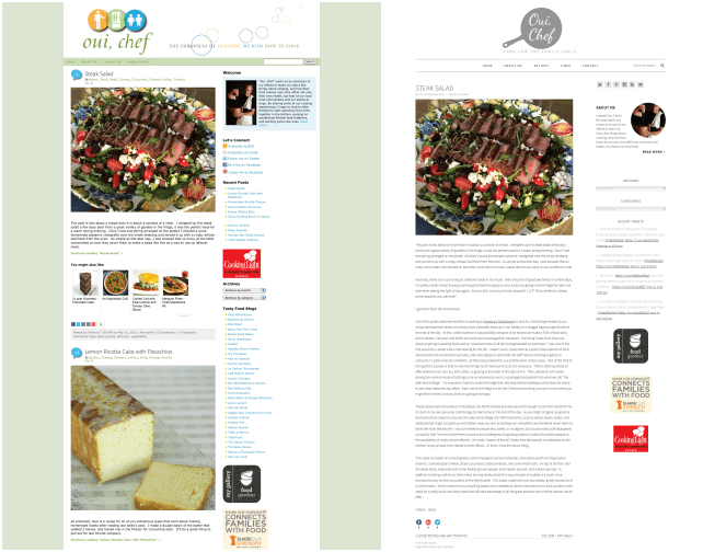
Viktor Klimo, Foliovision’s Senior CSS Designer worked closely with Steven. The first step Viktor and Steven took was choosing a commercial theme, which they customized according to Steve’s wishes. If you compare the previous design with the new one, you’ll see a more minimalistic visual layout and white and gray combination instead of the old busy and colourful design.

Before and after
According to Viktor, Steve got into the whole process with a clear idea of what kind of a design he wants, which made the job much easier. He sent us a clean idea of how the site should look like, including fonts and inspirational sites he found.
“Over the past few years I became less attracted to these really busy sites with lots of activity and action and bright colours and all sorts of moving parts on the page,” Steve told us. “I wanted something that was much simpler so that my food could be the star. I wanted something a little more elegant and easy to navigate, but to still have some functionality in recipe searching.”
The Recipe Plugin
If I wanted to send people out to print, I had to set up a Google Document. They had to load a separate page on Google Docs to print it out. It’s so much better now, because it’s all within the blog where people can print directly.
The recipe searching was one of the main reasons Foliovision and Steven decide to go with the Foodie Pro custom theme, which was adjusted according to Steven’s needs. Even though the old OuiChefNetwork.com had a Recipe Index, Steve had to add his recipes manually to this list. After the redesign he only has to use proper categories to file them under the right section. His Recipe Index now has also 3 types of different searches.
But the “Recipe Plugin” that Foliovision installed is Steve’s favourite thing about the new website.
“The Recipe Plugin that came from Foliovision is just terrific,” said Steven. “I used to just handwrite all my recipes in and do formatting on the page, to highlight the colour to make them stand out.”
Every recipe now comes with a print version.
“If I wanted to send people out to print, I had to set up a Google Document. They had to load a separate page on Google Docs to print it out. It’s so much better now, because it’s all within the blog where people can print directly.”
If you don’t like to print out things unless you have to, and you’re not old-school enough to write the recipes on a piece of paper, you might like this other option that comes with the Recipe Plugin. Anyone who has ever cooked reading a recipe on his phone or tablet knows how annoying it is having to scroll with your fingers all sticky and dirty from the food. So in addition to the print version, the Recipe Plugin comes with a Cooking Mode, which reformats the recipe to fit on one screen.

Print Mode

Cooking Mode
“It’s outstanding,” said Steven. “That was a really terrific thing to be able to add to the blog.”
The Logo
It makes people think immediately of cooking. A lot of times you go to sites and it takes you a while to figure out what they’re doing. They may have trees, and birds and flowers up in their logo and you don’t realize until you go further down that it’s actually a cooking site.
After the functionality was set up, it was time to come up with an eye-catching home page. On his old website, Steven had a colourful, busy logo with a tagline describing his diary of cooking with his children.

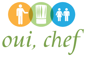
The original Oui, Chef logo
Now, since he’s not cooking with them anymore, this needed to change.
“I knew I had to get rid of my old logo because it represented this idea of imparting knowledge to my kids, giving my kids something,” explained Steve. “And the tagline had to change. At first I actually didn’t even know that I wanted to do a mark per se. I just thought I was going to have Oui, Chef and a tagline, and not really have any artwork associated with it.”
 Viktor’s attempt to improve the existing logo
Viktor tried playing with the original logo and clean it up by removing the shadows, but it still didn’t work quite well with the overall look of the site. Besides, Steven had a clear idea of using monochrome design.
So the brainstorming began.
 Playing with the chef’s hat
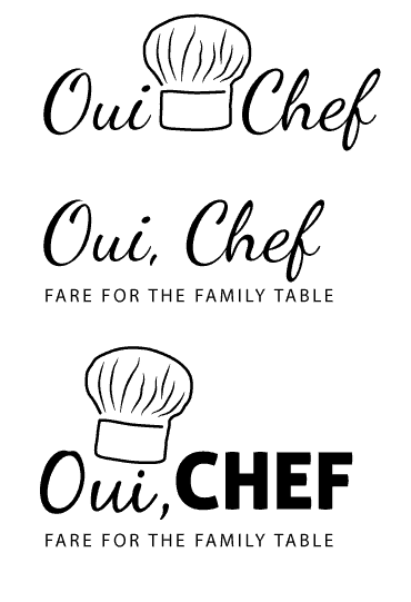
This is when Alec stepped in and suggested that Steven should pick some sort of a mark to represent his website. What is the first symbol one associates with a cook? It’s probably a chef’s hat. This was the first symbol Foliovision and Steven considered.
But the idea was quickly dismissed, because according to Steven, it wouldn’t represent the idea behind the website.
“The idea of a chef’s hat seemed a little formal,” he said. “I am a professional cook, but I’m not a professional chef, I certainly don’t wear a toque every day. I was a little concerned that people would look at that and say ‘This is a professional chef, he’s not going to be doing recipes that I can cook for my family. He’s going to be doing fancier stuff.'”
A chef without his hat on is still a chef, but it’s hard to cook without any cookware. Which is why Steven and Foliovision went with a skillet as a logo instead, with a slightly shorter handle which made it look more professional.
Steven liked the idea because it fit nicely with the rest of the website, due to its dark grey tone, but he also thought it’s a much better presentation of what he’s trying to do with his website.
“It makes people think immediately of cooking,” he said. “As soon as you look at it you go ‘Okay, so this is a cooking site, it has something to do with cooking.’ A lot of times you go to sites and it takes you a while to figure out what they’re doing. They may have trees, and birds and flowers up in their logo and you don’t realize until you go further down that it’s actually a cooking site.”
The name of the website was to be a part of the logo, so the next thing Viktor and Steve had to decide on was the typeface.
At first they tried to use Humanist typefaces, but aligning all letters into a grid. Other, fancier typefaces were tried too (like chalkboard and cursive serif), but most of them made it look more cluttered. After all we have tried script typefaces and finally got one that looked elegant.

The Evolution of the Oui Chef Logo
“I thought it was very well done. Something I didn’t anticipate doing, but I’m glad I put in the extra money for it,” said Steven.
The website’s tagline had to change as well. It used to say “The Chronicle of Teaching My Kids How To Cook”. Given the minimalism of the whole site and the logo we have proposed shorter versions for the tagline:”Fare For the Family Table”, “Cuisine For The Family Table”, “Nourishment For Your Family” or even a supershort one “Family Cuisine”. In the end, Steven picked “Fare For the Family Table”.
The Feedback
Even though Steve took a year off from blogging and he’s still trying to reconnect to his old fellow bloggers, he’s already getting positive feedback to the new look and new functionality of his website.
“My wife, who has a tech background spent some time going through it and she is really impressed,” Steve told us. “Not just with the change in the design, but the increase of functionality and how much friendlier the site is to use now. It used to be sort of a cluegy thing, that worked fine, but it wasn’t very elegant and it didn’t offer that much functionality.”
Working with the Foliovision team
Viktor was very generous that he gave me time on a weekend. We actually ended up doing it on a Saturday, so he took time off his normal regular work schedule, which I was very appreciative of.
Foliovision is based in Central Europe and has clients from all over the world. It’s understandable some of them would be worried about communication due to being in different time zones. However, we have years of experience working with international clients and it’s never a problem communicating with clients in real time. Steven, based in Boston, Massachusetts had similar concerns at the beginning of our cooperation, but soon enough he realized that Viktor and Ivana might be sitting in the next room for all he knew, because they were very responsive.
“Generally in the afternoon my time is when I would hear back from Viktor and Ivana, and occasionally from Alec, and all of them were very responsive,” said Steve. “If I had a question or a concern, or I was sending them links or ideas, I’d send them up and get fairly immediate feedback.”
After the project is complete, each of our clients gets a training session with Viktor, usually done through Skype. Steven was very satisfied with Viktor’s approach during their training:
“I took us a little bit to make that work technically. And that was more of a problem on my end. But once we got it set up, Viktor was very generous that he gave time on a weekend. We actually ended up doing it on a Saturday, so he took time off his normal regular work schedule, which I was very appreciative of.”
Viktor records these training sessions and sends them to clients as video tutorials they can always reach for in case they need help with the website. Of course you probably won’t remember everything from the training session, no matter how thorough it is, so this video manual can be very useful. Especially if you’re not a technical person.
And this means that even though the project is done, you still get to have a little piece of Foliovision with you to reach for if you should have any problems.
“So far I haven’t had to go back to the video of our session Viktor sent me, because he did such a good job explaining it,” Steve told us. “I’m sure I will at some point in the future and it’s terrific to be able to have that to refer back to when I do come up against something that I don’t quite remember. So there is a lot of value in that, from a client’s perspective.”
It’s always nice to know you’ve made someone’s life better with your service, but it’s even more rewarding when your client is as cooperative and open like Steven was during this project. We find that this is the perfect recipe to get the job done right – honesty and teamwork.


 Viktor’s attempt to improve the existing logo
 Playing with the chef’s hat
Leave a Reply