Back in 2012, J Hutcherson, the General Manager of the US National Soccer Team Players Association (USNSTPA) contacted Foliovision with a website migration request. The main focus during the migration was getting out of Typepad and onto a solid technical platform. The new website was functional and clear and in line with sports sites of 2012. The old content had minimal illustration so the underlying design had to be text-centric.
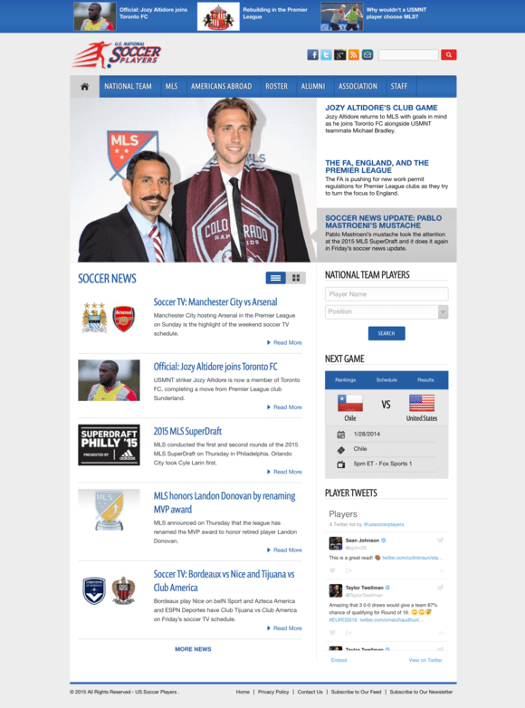
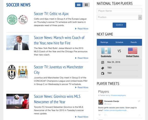
Ussoccerplayers.com before the 2016 redesign
Since then, Foliovision had hosted and maintained USsoccerplayers.com adding small features every year, at J’s request. At the end of 2015, J contacted Foliovision with big news. It was time for both a new logo and a new, more visual design.
The Redesign
What was done:
- new logo
- new theme
- a fixed right sidebar, while the main column featuring the articles continues to scroll
- new post layout
- bigger images
- a space dedicated to most popular sections and a great format for it
J is also a member of the Internetsoccer writing staff, and has been writing for USsoccerplayers.com since 2012, so he’s in daily contact with other sports related websites. When other websites started to change and evolve, he thought it was time USsoccerplayers.com did the same:
I saw that the way the website looked after all these years and I thought that it still looked fine, but it hasn’t really caught up with the way the Internet moved in terms of what the other sites look like. And not just soccer related websites, but other sites, that are content heavy.
The site was simple enough, but still busy at places. So Foliovision and J got to work, in search for a new fresh face for the website.

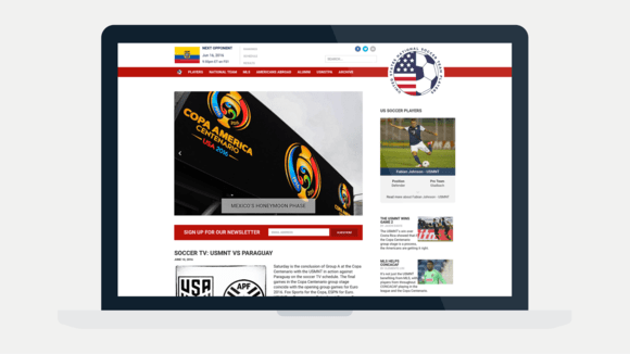
New Home Page
Fixed right column
The fixed right column was set up across the website. When you scroll down the page, you’re actually scrolling through the articles, but the right sidebar stays in place, which means you always have access to more information about the players, most recent posts and player’s tweets.

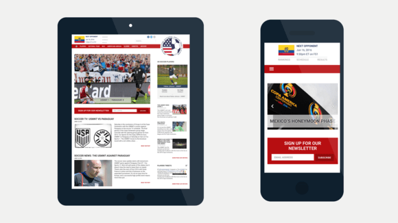
Home page in the tablet and mobile version
New post layout with bigger photos and a bigger font
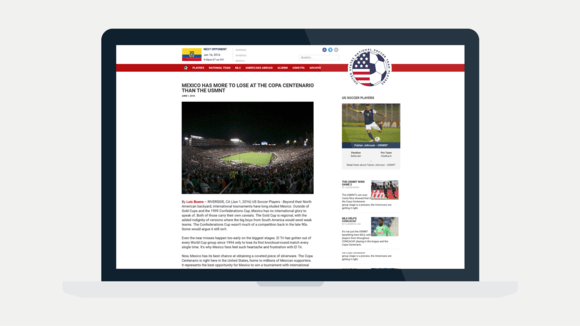
In terms of post layout, J was inspired by Vanity Fair and Medium. There is no sidebar on Vanity Fair’s articles, but Foliovision and J decided to keep it. What we got is a clean look, with a narrower text column, and bigger photos.

New post layout in the desktop version
Although the site has a minimum of graphics, we’ve encouraged the client to use more images and photos in the articles and to upload them in a higher resolution. Before the redesign, all photos were uploaded in a 600 x 400 px size, which wasn’t enough for the new theme.
The maximum width of the thumbnail on the website was changed to 720 px and the client was advised to upload images at 2000 px going forward, because of the growing number of users using Retina screens.

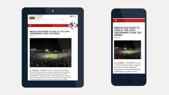
Tablet and mobile version of the post layout
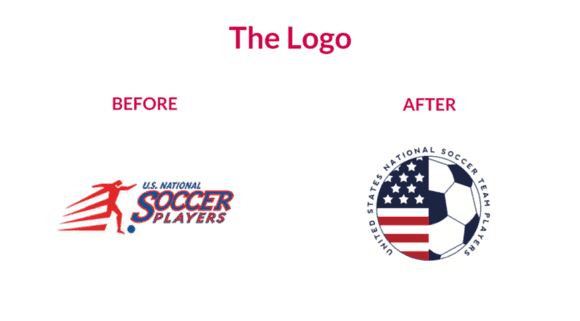
The logo
Requirements:
- red, white, blue
- unique, but not too busy
- the name of the association needs to be incorporated
The old logo started to look very dated, but since it was used on all of the team’s apparel and marketing materials, the association wasn’t very open to changing it, at first.
J explained the old logo was done in the 90s and it was pretty pricey:
It was done by a company doing a lot of professional sports logos in the US back then, but it was expensive. And so, even though it looked really dated, there was sort of a push about not bothering to do anything with it. It was really expensive, tens of thousands of dollars back then, when people were still doing graphic design the old way.
However, the association noticed that people have started to complain about the dated logo and kept asking for something fresh. That’s when USNSTPA knew it was time to change it:
We had a group come in that wanted to do work with us and they told us they couldn’t stand the logo and then we had another group said that if they were to work with us, they insisted we redesign the logo.

Everything needed to be red, white and blue
The logo needed to be red, white and blue, as is tradition among sports organizations in the U.S.:
In the U.S. everything’s red, white and blue when it comes to the national team. Unlike for example Netherlands, where the football team uses orange, and the flag is red white blue.
The main goal was to avoid copying any other official soccer website. Many national and international official leagues and associations share the same few symbols and Foliovision needed to come up with something unique, but not too busy at the same time.
While trying to avoid any general symbol like the ball or player statue, we have used a shield to resemble a soccer club. But to make the shield speak clearly that the website is about soccer, it always became too cluttered. That is when we decided to combine a ball with the US flag. The name of the association encircles the logo and it can work even without it.
Revolutionizing the header
What was done:
- Next Game widget in the top left corner
- showing only the opponent’s flag
- logo in the right top corner, hovering over the nav bar
- smaller version of the logo as a home icon in the nav bar
Most sports-related websites have some kind of a indication of the upcoming match placed either in the sidebar or in the header. It is one of those things users rely on while browsing the site. In the old version, the next game widget was placed in the right sidebar above the tweets.

The next game widget was located in the right sidebar
The widget was completely restyled. First big change was removing the U.S. flag and leaving only the opponents flag in the widget, because it’s only natural that all matches will include the U.S. national soccer team. Viktor kept the opponent’s flag, enlarged it and added the date of the match and the name of the TV programme streaming the game.
The most important change however was the new location for the widget. It was placed at the top left corner, which is probably the most prominent location on any website.
This space is usually reserved for the logo and this was another small revolution, backed with the courage of the client.
The logo was moved to the right top corner of the header, enlarged and now hovering over the navigation bar stripe. This way even its unusual location doesn’t weaken its importance.

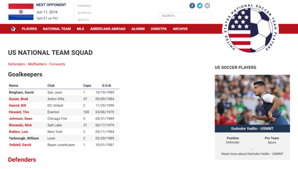
Next Game widget, Logo on the right side and a new home icon in the nav bar
A smaller version of the logo was placed in the navigation bar, which gave the website a custom home icon, instead of the default house-icon most websites usually have.
The old version of the website had a Players search widget in the right sidebar, which wasn’t used that much. Instead of removing it, Viktor transformed it into a Featured Player widget, and now it looks like a small card with a photo of the player and the most important info. The client can hand pick the ones, which are on display, having full control over how often they are rotated.
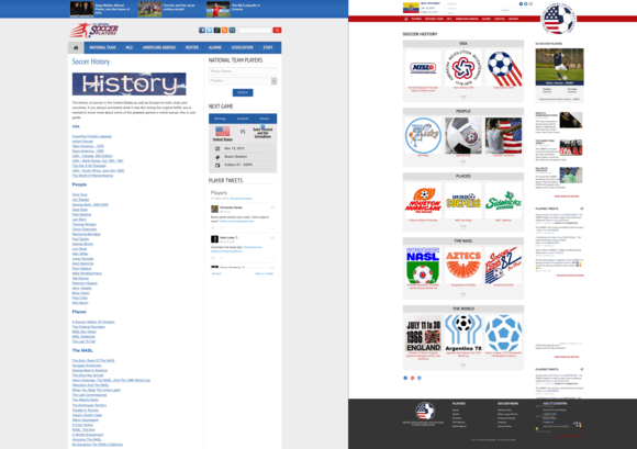
The special section format – “Soccer History”
The website has a special section called “Soccer History” which is a great source of information about the history of soccer in the United States as well as Europe for both clubs and countries. In the old version, it was in the form of a list with links to separate pages on the subject.
We decided to have some fun with it and make it look more special, so Viktor created a grid featuring the first three links in each of the section as thumbnails with a button to “see more” of the section, which was hidden to keep the space uncluttered.

Soccer History Before vs After
Working with Foliovision
J was well prepared when he approached Foliovision with the redesign request. He had a rough idea about what the new site should look like, but the final result turned out to be so much more than he and the association expected. After the basics were done, such as the post layout and the logo redesign, the rest of the changes emerged during the creative process according to J:
We were happy with the changes, but it wasn’t what we asked for at the beginning, because we wouldn’t have known to ask for them. You had to sort of show it to us, what would obviously work a lot better.
In Foliovision, we strive to exceed expectations and to encourage our clients to think big. In our experience, the clients appreciate it more than just getting what they asked for. So did J:
The whole process was probably not as easy as it could have been had people (on our side) said, ‘we don’t like this’ or ‘please change this and this’.. Most of these comments – ‘I don’t like this, we need to change this’, came from you guys. Which was obviously helpful, because without that it would be a very different website.
Steve Jobs once said: “A lot of times, people don’t know what they want until you show it to them.” We agree with his statement only to some extent. Customers know what they want, they know what problems need to be solved, but what they don’t know is the best and most efficient way to do it. That’s why Foliovision starts by identifying the problem and then creates a working, elegant solution, even if it means that we need to spend more time coaching our clients and tailoring the process according to their current and possible future interests.
Leave a Reply