Forum Replies Created
-
-
6 years ago in reply to: remove now playing

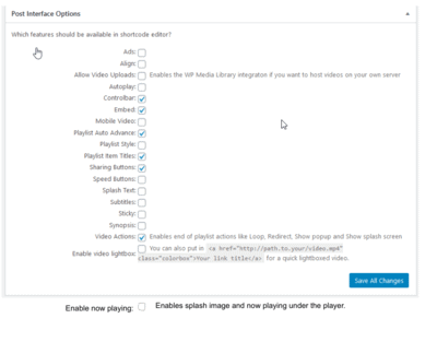
The improvement to be made in my opinion, for cases like mine, or by those who do not want to work with the code for lack of time, would be to add the item in the control panel as shown in the following image: activate or deactivate this now playing option. But I don’t know how much hard work it would take to do it. I honestly don’t realize, if this adaptation means a lot more work for you, in reviewing the already consolidated structural code figure. Of course I believe that many customers over time, faced with the same problem as mine, if this were implemented in my opinion they would have a great deal more chance to better adapt their tastes to your already excellent player.
 6 years ago in reply to: remove now playing
Dear Martin,
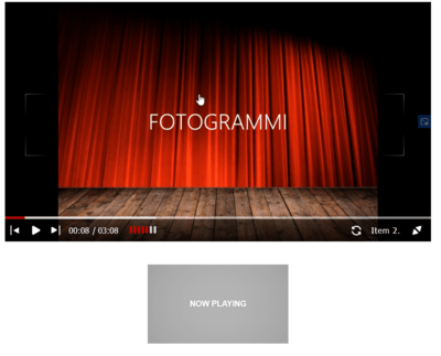
thank you for your reflection. I put the title and the splash image in some article of the playlsit and I made the following screenshot:
 6 years ago in reply to: remove now playing6 years ago in reply to: remove now playing6 years ago in reply to: remove now playing
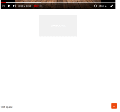
ok, i can upload, png file. For example I used the 2014 skin, but now playing, it’s still there. the test page is on this address: https://ratve.it/test-foliovision/
6 years ago in reply to: remove now playing6 years ago in reply to: remove now playing
Hello,
thank you for your kind replay, i removed this css from my theme:
.fp-playlist-external a .now-playing {
display: none;
}.fp-playlist-external.fv-playlist-design-2017 a.is-active h4 {
display: block;
}.fp-playlist-external.fv-playlist-design-2017 a.is-active h4 span {
background-color: rgba(128, 0, 0, 0.5);
}.fv-fp-list {
display: none;
}.flowplayer .fp-controls {
background-color: transparent !important;
}and now the now playing is more evident, for about the item, now they are going, but i do not like to see items on the control bar and the now palying under the player. I use horizontal playlist style. In the skin i use playlist 2017 and read: “Hint: you can click the thumbnails to switch videos in the above player. This preview uses the horizontal playlist style. ” but this is just what i do not want and i see the also 2017 with caption or 2014 design is with thumbnails to switch.
Thank you for your help.
Best regards.
ratve
6 years ago in reply to: remove now playing
hello,
i put the css above in template’s style sheet, by going to Appearance> Customize> Additional CSS, and pasting it into the code box there. Clicked “Publish”.it is the right place?
Thank you
6 years ago in reply to: remove now playing6 years ago in reply to: remove now playing
Hello,
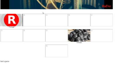
thank you for replay, the link is http://www.ratve.it where it is possible to see the folionvision player and below the post “Detersivi naturali. Obbiettivo Ambiente”, between these, there is: (1) much white space, (2) further if one click on this white space, automatically swicth player next song. We would remove this white space and this automatic switch on.Thank you for your kind replay.
Best regards.
RaTve
6 years ago in reply to: remove now playing
Hello,
thank you for remove sensitive data. For about Playing Now stamp
I see that there is still an unwanted space between the player’s bottom edge and subsequent articles. Also even if this space is white, if I touch these white space a blue box always appears and the player goes to the next track. This is the css i copyed from your suggested link:.fp-playlist-external a .now-playing { display: none; } .fp-playlist-external.fv-playlist-design-2017 a.is-active h4 { display: block; } .fp-playlist-external.fv-playlist-design-2017 a.is-active h4 span { background-color: rgba(128, 0, 0, 0.5); } .fv-fp-list { display: none; } .flowplayer .fp-controls { background-color: transparent !important; }But this space remain.
Thanks for collaboration.
ratve
6 years ago in reply to: remove now playing
Dear Foliovision,
good morning,
We kindly ask you to delete the system info of the ratve.it from this forum, as they are sensitive data and should not be publicly transcribed. Thank you very much.
Yours sincerely.
ratve
electronic television radio6 years ago in reply to: remove now playing
Hello,
thank you for your replay, i have to say that i risolved the “hide now playing” but still remain a blu box, when i touch the screen. Than there is so much space between the player and the posts that follow, in the smartphone. Also i read all css support and help, but i can’t hide the control bar when the playlist play. It is normal that when movie play, the control bar is hiding, instead no, it remain always on. Thank you for any replay and i am not shure if i can post here these others questions or i have to open some others forum post.
Best regards.
RaTve
( System Info removed )


