Foliovision › Forums › FV Player › How to … › remove now playing
-
-

Hello Ratve,
Thanks for reaching to us! Can you please provide us your system info? You can find it at:
WP Admin dashboard -> Settings -> FV Player Pro -> Tools -> System info
You can just copy the system info content into your reply, thanks!
Also, link to your website with such a problematic video would be really beneficial for us.
Thanks,
Juraj
Hello,
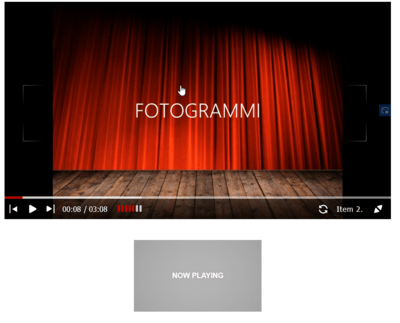
thank you for your replay, i have to say that i risolved the “hide now playing” but still remain a blu box, when i touch the screen. Than there is so much space between the player and the posts that follow, in the smartphone. Also i read all css support and help, but i can’t hide the control bar when the playlist play. It is normal that when movie play, the control bar is hiding, instead no, it remain always on. Thank you for any replay and i am not shure if i can post here these others questions or i have to open some others forum post.
Best regards.
RaTve
( System Info removed )

Hello Ratve,
Thanks for the info.
Here’s a link to our guide on how to remove the “now playing” stamp.
Perhaps you can be inserting the CSS into wrong place, please also check begging of the guide for guidance on that.
If you have troubles dealing with CSS you can also order our Make FV Player work with your theme service. With purchase of this service we will log into your website and tweak all CSS and eventually fix all bugs for you within few hours from the purchase.
Thanks,
Juraj
Hello,
thank you for remove sensitive data. For about Playing Now stamp
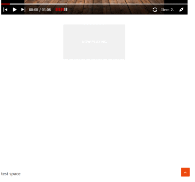
I see that there is still an unwanted space between the player’s bottom edge and subsequent articles. Also even if this space is white, if I touch these white space a blue box always appears and the player goes to the next track. This is the css i copyed from your suggested link:.fp-playlist-external a .now-playing { display: none; } .fp-playlist-external.fv-playlist-design-2017 a.is-active h4 { display: block; } .fp-playlist-external.fv-playlist-design-2017 a.is-active h4 span { background-color: rgba(128, 0, 0, 0.5); } .fv-fp-list { display: none; } .flowplayer .fp-controls { background-color: transparent !important; }But this space remain.
Thanks for collaboration.
ratve

Hello,
thank you for replay, the link is http://www.ratve.it where it is possible to see the folionvision player and below the post “Detersivi naturali. Obbiettivo Ambiente”, between these, there is: (1) much white space, (2) further if one click on this white space, automatically swicth player next song. We would remove this white space and this automatic switch on.Thank you for your kind replay.
Best regards.
RaTve

Hello Ratve,
I’ve checked your website and I’ve done some CSS testing.
1. I can’t see any playlist items on your website on desktop or mobile. Please delete the additional css from your theme and check if that resolves the issue.
2. After doing this please contact us and I’ll manually check your website and prepare CSS code for you.
Thanks for your patience,
Juraj
Hello,
thank you for your kind replay, i removed this css from my theme:
.fp-playlist-external a .now-playing {
display: none;
}.fp-playlist-external.fv-playlist-design-2017 a.is-active h4 {
display: block;
}.fp-playlist-external.fv-playlist-design-2017 a.is-active h4 span {
background-color: rgba(128, 0, 0, 0.5);
}.fv-fp-list {
display: none;
}.flowplayer .fp-controls {
background-color: transparent !important;
}and now the now playing is more evident, for about the item, now they are going, but i do not like to see items on the control bar and the now palying under the player. I use horizontal playlist style. In the skin i use playlist 2017 and read: “Hint: you can click the thumbnails to switch videos in the above player. This preview uses the horizontal playlist style. ” but this is just what i do not want and i see the also 2017 with caption or 2014 design is with thumbnails to switch.
Thank you for your help.
Best regards.
ratve

Hello Ratve,
this thread is starting to be quite long. How many of these issues do you get when using Twenty Twenty or some other default WordPress theme?
You also said “further if one click on this white space, automatically swicth player next song. We would remove this white space and this automatic switch on.”. This issue was fixed in FV Player 7.4.9.727, see this not in changelog:
“Bugfix – invisible menus trapping click events below the player on mobile”
Did you do any modifications to the CSS which could prevent our fix from working?
Thanks,
Martin
ok, i can upload, png file. For example I used the 2014 skin, but now playing, it’s still there. the test page is on this address: https://ratve.it/test-foliovision/

Hello Ratve,
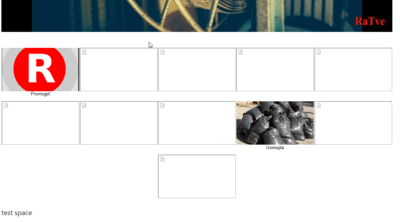
since you didn’t enter any of the playlist item titles, it falls back to using “Now Playing”. If there would be item titles it would highlight the item title, but there are no title it wouldn’t have any way of marking the current item.
That huge spacing is caused by the fact that you have about 10 items in that playlist and none of them have titles nor splash images.
I see that this is not perfect. Some time ago we decided to remove any frames from the playlist item titles to provide a cleaner minimal look for people who do put in splash screen and item titles.
So we will wonder what improvement we could make to help in cases like yours. Personally I would even show the file name without extension if there is no title and no splash screen.
Thanks,
Martin
Dear Martin,
thank you for your reflection. I put the title and the splash image in some article of the playlsit and I made the following screenshot:


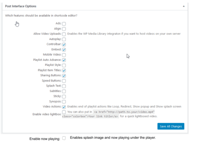
The improvement to be made in my opinion, for cases like mine, or by those who do not want to work with the code for lack of time, would be to add the item in the control panel as shown in the following image: activate or deactivate this now playing option. But I don’t know how much hard work it would take to do it. I honestly don’t realize, if this adaptation means a lot more work for you, in reviewing the already consolidated structural code figure. Of course I believe that many customers over time, faced with the same problem as mine, if this were implemented in my opinion they would have a great deal more chance to better adapt their tastes to your already excellent player.


