We are happy to announce bunch of new beautiful and useful visual improvements.
Updated Colour picker
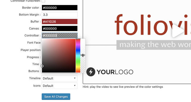
As we were using our player every single day for several years we actually managed to get sick of our beautiful red and black colour palette. So we are glad to introduce you our new upgraded colour picker featuring transparency options. The colour palette of whole player is in your hands right now so you can completely personalize face of your videos.
Social sharing buttons update
Another nice upgrade is switch from old school PNG to new SVG files for social sharing buttons. New SVGs are sharper, crispier and easier to work with for future improvements such as greyscale or less bulky icon faces for slim theme. Oh and we’ve also deleted the Google+ button. R.I.P Google+.
New full-screen button placement options
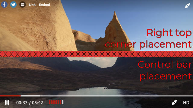
As we always try to listen to our customers we could not overlook that several customers were asking us for ability to move the fullscreen button to the control bar, because top right corner placement can be quite unusual for users used to YouTube or Vimeo layouts so we have added that as well.
Volume bar bug fixed
We’ve received few bug reports on volume bar not letting people drag outside it’s own boundaries or not working properly. We have fixed it and submitted the fix to Flowplayer team as well as it was bug inside Flowplayer 7 core.
Stay tuned for more
We are trying to make our FV Player plugin better ever single day by bringing more and more upgrades and updates into it. You can actually help us a lot, by giving us feedback.
So if you have any tips or questions, don’t hesitate and contact us via our Forum!


Leave a Reply