Evernote caused an earthquake last year with changes to their beloved freemium model. Many users were forced to pay if they wanted to keep using the app on more than two devices and enjoy storage space larger than 60MB/per month. I was one of those who accepted the changes (with a bitter face), but not long after the company raised the pricing again. By then, Microsoft OneNote was promoting its free product and Evernote migration tool. I was convinced, but never very happy about the OneNote’s organization, and UI/UX.
I stumbled upon Milanote earlier today. It is not officially released yet, but after signing up for e-mail notification once it is out I was given the option to get on beta testing. All I had to do was tell them how I plan to use the app, and what similar app I can think of in a Typeform. Done and I was in (love).
User Interface / User Experience
If you read my comparison of Hootsuite and Buffer you know I am a huge fan of minimalistic and flat design. And it’s pretty popular and trendy.
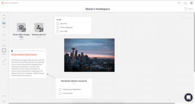
Milanote’s “homepage” is an empty (at the beginning) canvas called Workspace where you drag and drop stuff. It is bordered by two bars – top and side.
Top bar is divided into two parts:
- The upper part indicates what you’re working on, who is active in your Boards (sharing and collaboration is big in Milanote, keep on reading!), changes made, and drop-down settings menu
- The lower part stores name of the board/workspace currently open, drop-down sharing menu, and Export option (keep on reading!)
Sidebar is the creative bar. Here you cab find your content options – Cards.
Cards work on drag and drop basis:
- Note – drag and drop on to canvas, or double click on canvas, and jot down your thoughts
- Image – either drag and drop a file from your computer, or upload right away from the interface
- Link – store URLs, description is customizable. Dropbox and Google Drive links work well!
- Column – serves as a grouping of cards within a Board
- Board – create new Workspace
- Line – connect Cards and Boards, create basic mind-maps
- Trash – you guessed it, drag and drop redundant Cards and Boards
Navigation is easy and intuitive. Although in Beta version, I haven’t experienced any major issues with content creation and editing.
Workspace and Boards
Every piece of content users produce is accessible from Workspace – the “homepage” Canvas. If you want to work on projects, or categorize your content and thoughts, you have two options:
- Create a Board. This is a folder with entirely new Canvas. For example, I created a board called ‘Milanote review’ for notes, links, pictures and gifs I would need for this blog post (Board’s icon is decided upon naming of the board, pretty sleek!)
- Combine anything into Columns. Unlike boards, columns don’t have their own canvas – they show on canvas. For example, hold CMD/CTRL while dragging a card to combine it with another card and you have a Column, or create it from the sidebar.
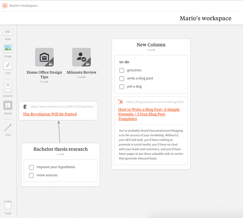
Create Columns by holding CMD/CTRL while dragging Cards
The best thing about Milanote’s organization and interface is that everything is always in sight, visible and movable. Everything stays where you place it. Moreover, you can lock stuff (cards and boards) in their places.
There’s no need to switch between notes in Milanote. They are just there. Simple as that.
I remember complaining about Evernote’s text editing features – they didn’t work very well. With OneNote, the text editing is great, but I don’t like the way the notes are organized. What about Milanote?
If Evernote and Google Keep had a child it would be Milanote.
Seriously, it’s the best of both worlds. Take note taking from the former app, interface from the latter, improve both of them, and this is what you get.
Miscellaneous
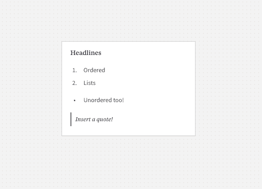
While text editing is not the main feature, or a point of focus, in Milanote it supports basic Markdown commands:
- # – H1
- ‘-‘ – unordered list
- 1. – ordered list
- > – quote
Another great feature are keyboard shortcuts. There are plenty of them, but just to tease you:
- CMD/CTRL + Return – hit this when jotting down something and new note pops up
- Hold ALT/Option while dragging and make a copy
- CMD/CTRL + Z – undo as many steps you need
When you are done and/or ready to share your work there are a couple of ways of going about it.
Export
- in PDF Canvas – this is basically a screenshot of the canvas you are currently viewing
- PDF – a file with all your notes across all boards and canvases
- Word – same as PDF, but in editable .docx format (both include pictures!)
- Markdown
- Plain text
Share
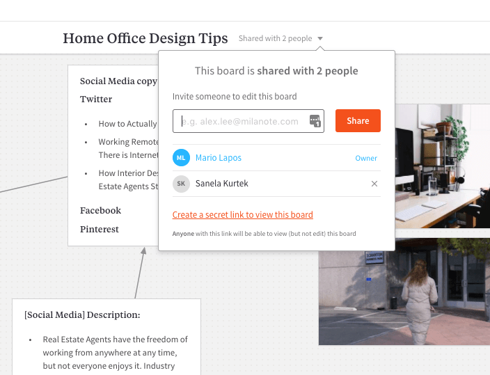
In the top bar type an e-mail address with whom you want to share your canvas and after they sign up/log in they can view your work and collaborate. You can view changes in the top right corner as well as who is currently working on it.
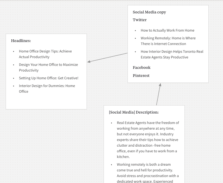
I shared a Board with my team leader so she could review Social Media copies, headlines, and visuals for a blog post I was working on. She did not have a Milanote account prior and when I asked her a day later what was her experience of creating it she said she didn’t even remember it. Smooth.
In case you don’t want the invited to edit your board, create a secret link which allows viewing only.
Ever note?
So, what is Milanote? The co-founder Ollie Campbell compares Evernote, bold move, to a box of lego. Yes, your notes, thoughts and such are with you everywhere and stored safely, but it’s a pile of blocks. This is where Milanote comes in and allows to sort the pile of blocks (thoughts) according to shapes and colours (just an example, sort them anyway you like!). You can see what you have and begin the connecting process. Steve Jobs’ quote “Creativity is just connecting things” is on point here.
But there is not much more to it. Collaboration and viewing are strong sides of this new Australian app, but collaboration works well also in Evernote. Plus, if you take your notes seriously with Evernote Plus you get to access them offline, while Milanote is web based (mobile version works fine, but there is no app yet).
Forget PDF annotation or anything close to the way Evernote handles documents. In my experience, I couldn’t attach PDFs, .docx, and videos in Milanote.
The release of Milanote couldn’t have come under worse/better circumstances. Evernote has just released 8.0 version of its app and it rediscovers the company. Wired wrote “it will try to make the transition from a note-taking app to being the place you do your best thinking”. Evernote CEO defends the huge update by saying it drove him crazy it took two minutes to open the app and jot down an idea, by that time the idea was probably gone. One of Milanote’s claims is “fast & tactile interface makes it easy to experiment, play, generate ideas and explore possibilities”. Well, this is awkward for the newbie, isn’t it? It’s true Evernote still displays lists of notes rather than canvas, but it took a huge step towards simplicity of noting (it actually got rid of steps between having and idea and noting it, but you get it) and it has plenty more to offer in compensation for one feature.
Pricing
Okay, for an average Joe who has more than 2 devices and wants to access notes offline Evernote is expensive. And while Milanote is in Beta it is free, but the co-founder Ollie answered my question in a chat and turns out it will cost you as well. It is not yet known how much, but he said this.
Milanote will be free to use until you hit the storage limit (100 notes, images or links). After that you can upgrade to a professional plan and get unlimited storage for a small monthly fee.
Small fee doesn’t sound bad for unlimited storage.
Conclusion
What is interesting in Milanote is that everything you place on the canvas in a board (which really is a folder) is a card (which really is a note). Milanote comes in with its own labelling of stuff we already know under different names. I got used to it quickly.
However, taking on Evernote, the industry giant (you may call it elephant in the room – pun intended) suggests Milanote is on to something bigger and big companies educate.
Now, time will tell if this move was in fact bold, or premature.
… have you noticed this Evernote-killer doesn´t have a … search??!!
uhm. I mean. unlimited content and notes. but you can´t search your own content?
I wonder what this omission means for the structure of thinking this company is bringing to the table?
Hi Oliver,
yes, that is strange indeed. I looked for search in the app and couldn’t find it, so I thought I’ll ask them. They said they’re actually working on the search right now and it should be launched in the next few weeks.
Cheers, Sanela