This presentation was originally given at WordCamp Slovakia 2013 in Slovak Technical University on 20 April.
Responsive web design – or “RWD” – is a web design approach focused on creating optimal viewing experience across both desktop and mobile platforms. Responsive design is mostly defined by 3 key components: flexible grids, flexible images and media queries.
What is “RWD”?


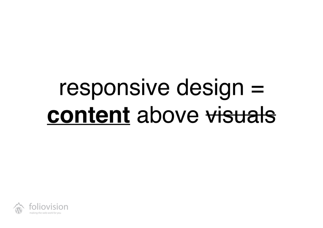
Yes – Rule #1: Rethink your content!
The web design world shouts that the future is “mobile first”. Everybody heard about it, everybody wants it. But do we really know what it means to “response” effectively?
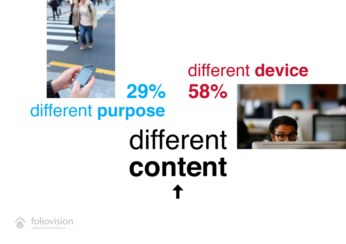
For us, responsive design is above all about the content. Different stories for different devices. Rethink your content based on the situation, in which user is experiencing it. But first of all – of course – know your visitor. The table below shows example statistics take from one of our client’s site – and we face this scenario repeatedly and it seems to be close to new standard.
Facts don’t lie, check the statistics of your website:
find out what your readers use to browse your site.
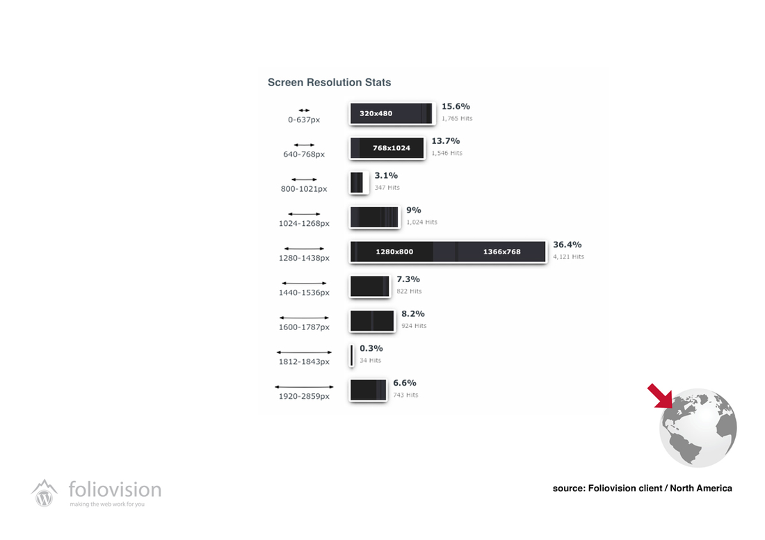
Client example: 29% of the visitors come from mobile devices!

The challenge that comes with 29% of visitors coming from mobile device and 58% [as it was in our case study], is to consider the gap between two very different experiences. 1028px being considered as standard is history. Mobile-big screen schizophrenia is like designing comparing luxury fashion magazine and tiny business card [to exaggerate].
1028px once considered as standard – not any more!
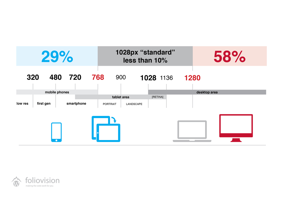
29% percent of visitors reading on mobile,
58% on huge screens.

Different device means different environment, situation AND
different user experience.
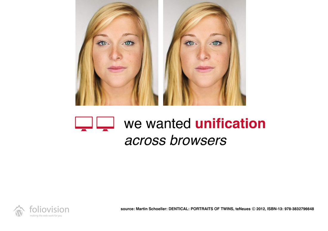
DO you remember? Once we prayed for unification and
struggled for same experience across browsers.
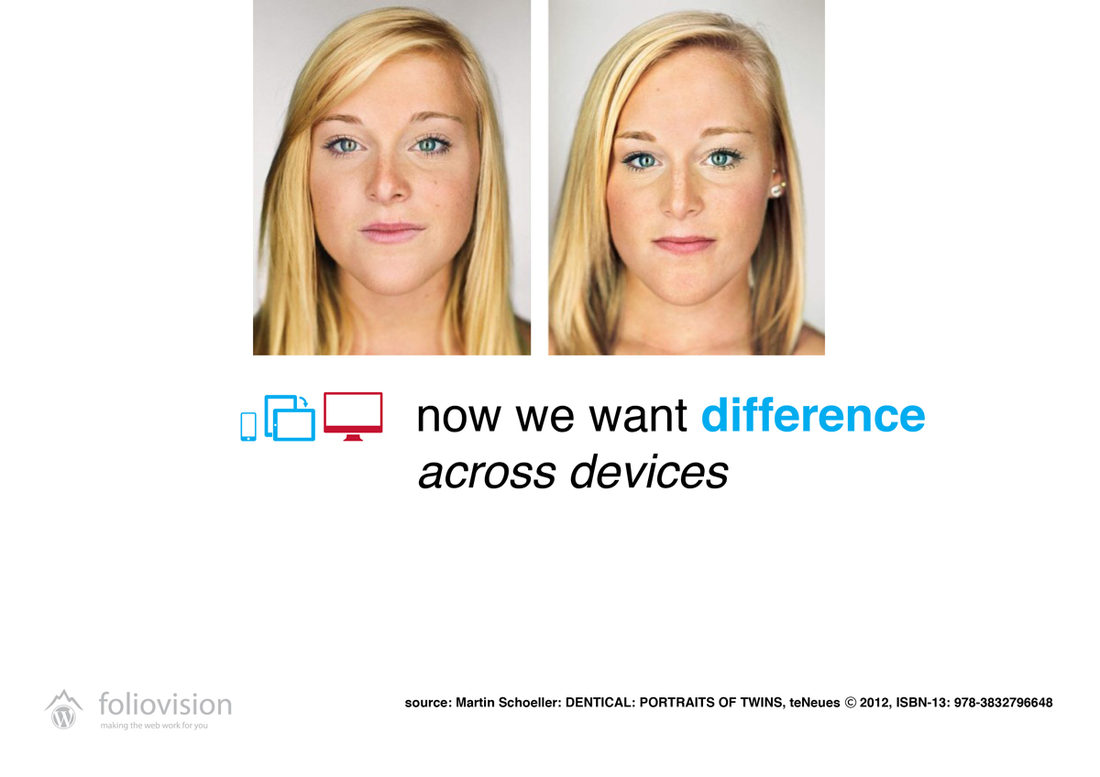
Today – we need to both understand and
appreciate the difference.
Example #1: Busy magazine. Mobile mindset: “I read the article and
commented. Let’s check what they’ve been saying.” Discussion first.

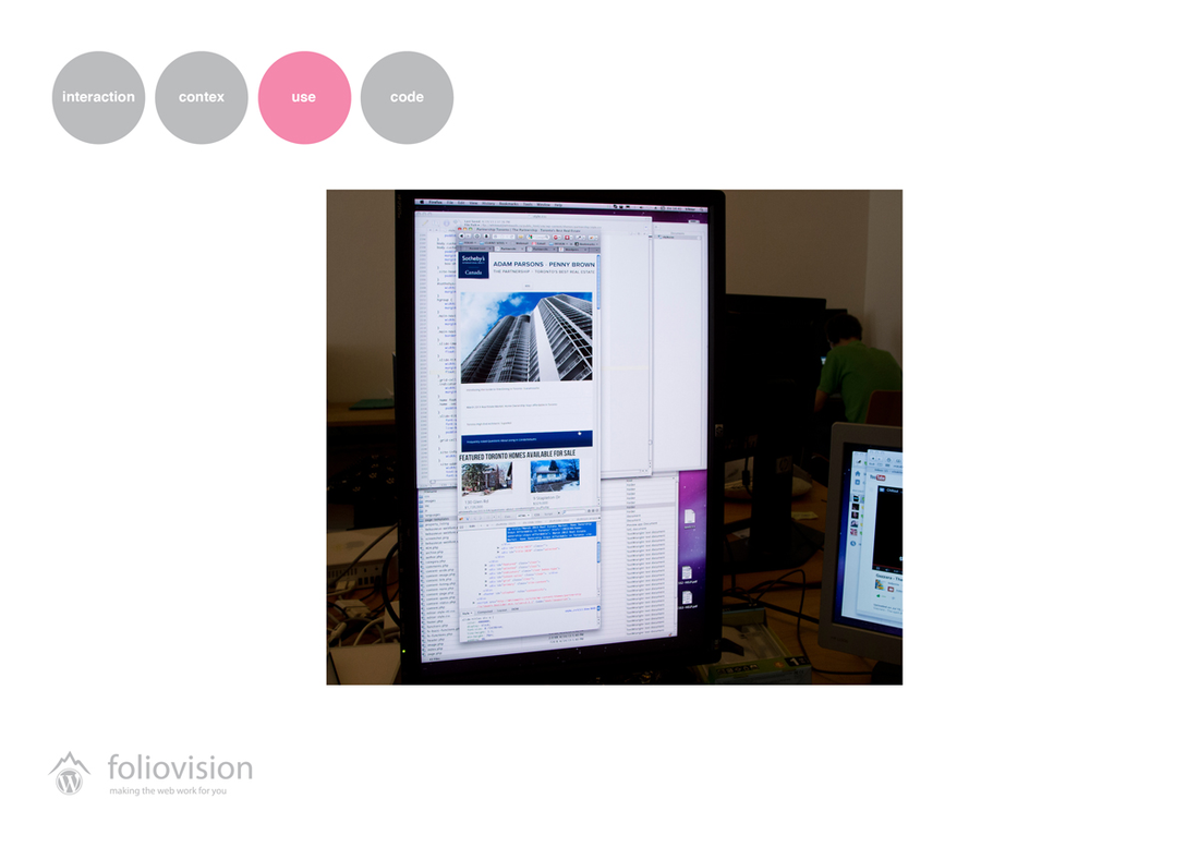
Example #2: Real Estate. Desktop presentation aims to claim
the competence. Once successful, visitor’s mindset once coming
back on mobile is clear: “I want to check latest listings”

Example #3: Food Blog. Visitor’s mobile mindset:
“I want to check the recipe while shopping”. Down to the point!

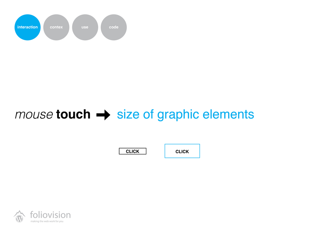
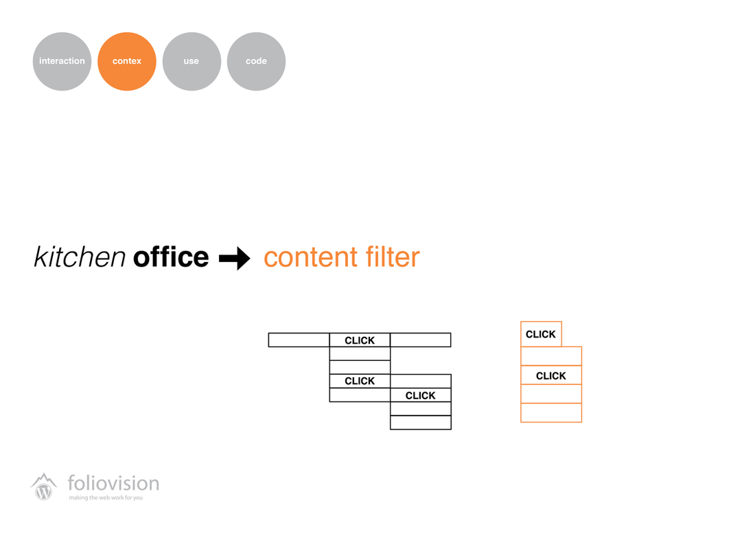
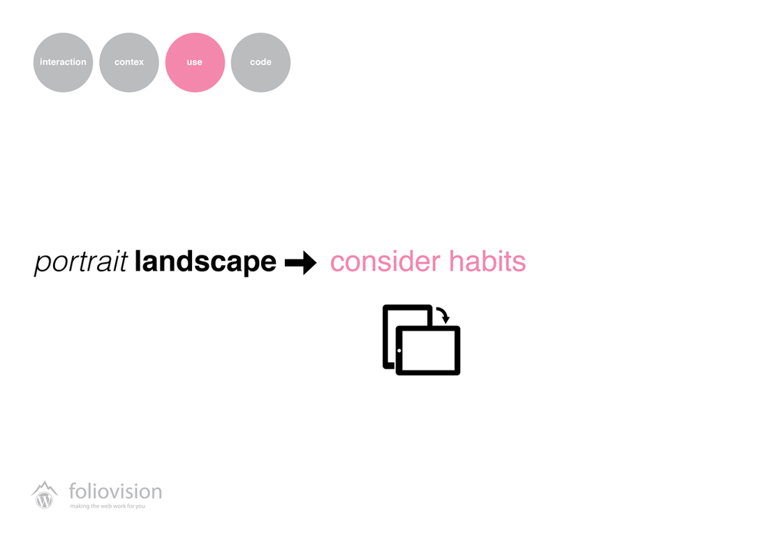
4 core aspects to consider when designing responsive template:
interaction, context, use and code.
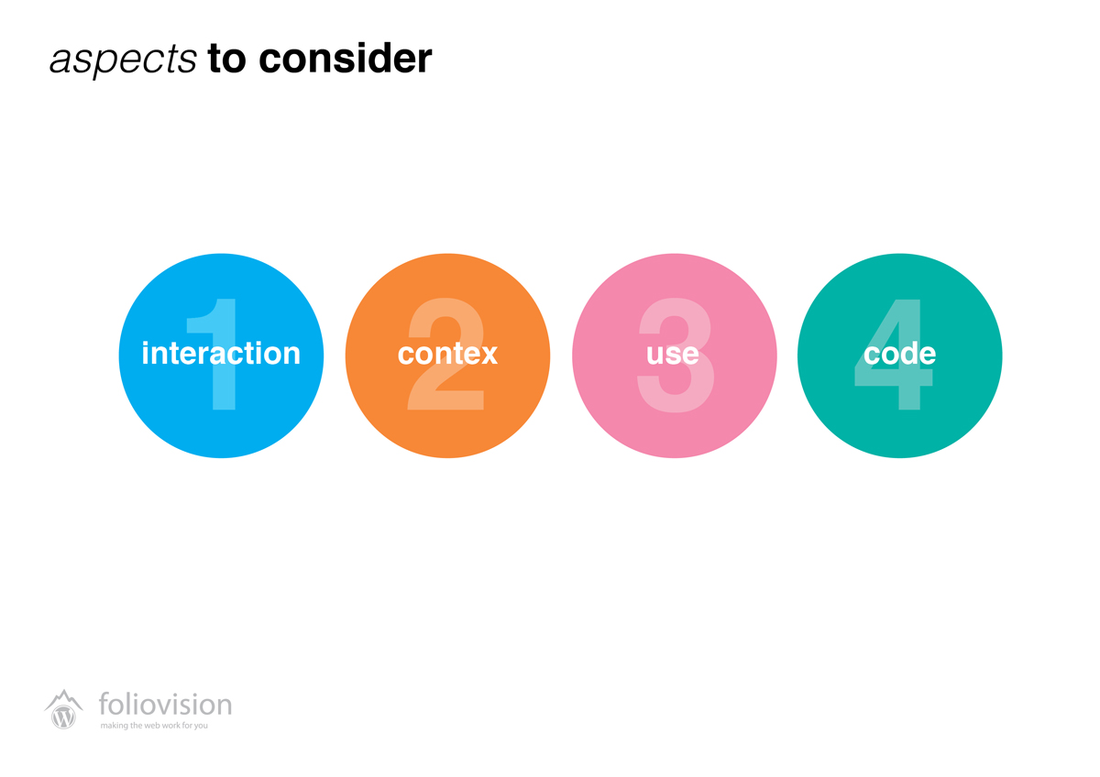
Interaction: Size of mobile elements matter.
Context: Filtering the content improves useability.
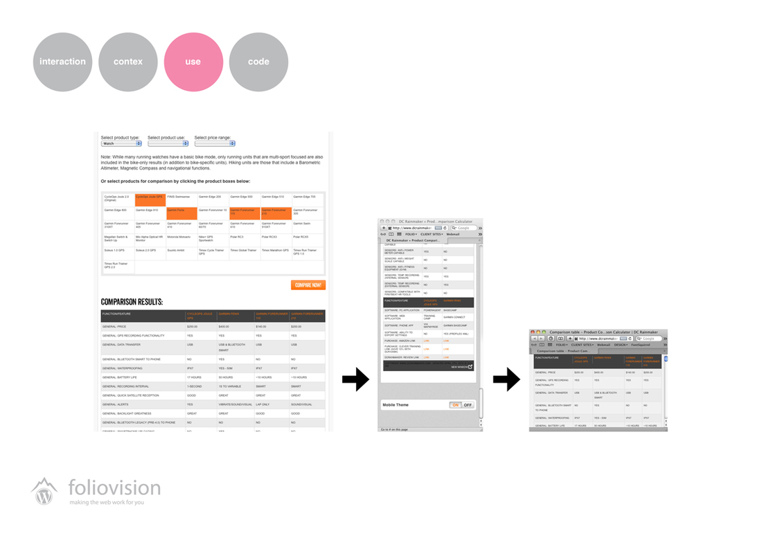
Use: Do not force to optimize for portrait view under all circumstances.
Consider dynamic use.
Example: data table, unreadable at small screen, still readable in landscape view.
It’s getting real even on the desktops.
Complexity is everywhere.
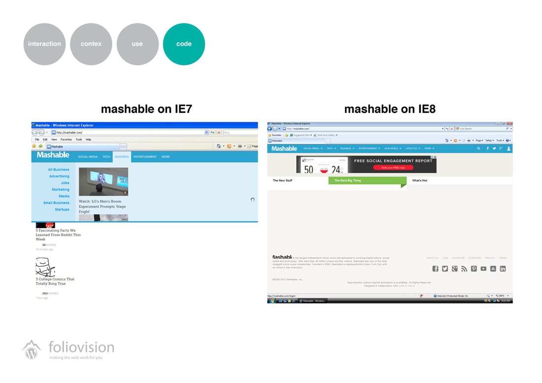
Code: How far to go in the optimization for old browsers?
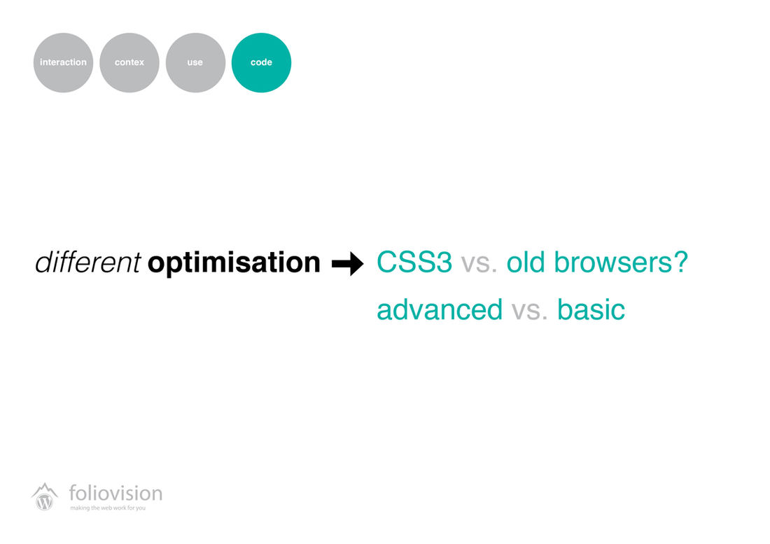
Code: Definitely client-specific.
Code: New approach means replacing pictures with code-based styling.

Code: Opportunities for creative trick…
Code: …not only for icons.

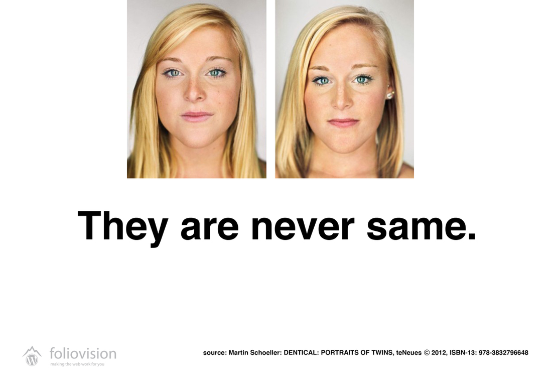
Never try to blindly follow the same model.
Think about useability first.
Download this presentation here.

Alec Kinnear
Alec has been helping businesses succeed online since 2000. Alec is an SEM expert with a background in advertising, as a former Head of Television for Grey Moscow and Senior Television Producer for Bates, Saatchi and Saatchi Russia.
Leave a Reply