-
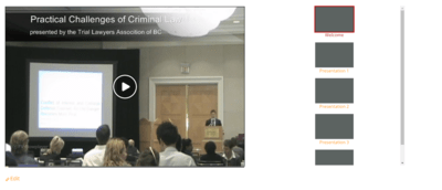
See how the player with playlist looks on a web page. The alignment is extremely strange, with the playlist off to one side the player to another and a huge gap between them. Does not look professional at all. Can anything be done to create a playlist (and its scroll bar) that is properly aligned next to the player?
Viewing 1 replies (of 1 total)
Viewing 1 replies (of 1 total)
