Foliovision › Forums › FV Player › How to … › Align Settings
-

Was trying to align as instructed. But firstly there is no Align checkbox in my option. Secondly, even adding the align code directly does not work. The Player displays the same and has a huge space between the player and the playlist p the player box is on the left and the playlist is on the right, with a huge space between them. How can this be corrected?
-
-

Hi Pesi,
I just noticed we had an outdated picture in the Alignment Settings so I replaced it. Don’t forget to activate the option for the shortcode editor.
However, if the shortcode parameters are not working as you have described, then maybe there is some kind of compatibility issue between FV Player and your theme. Could you send us a link to the page where you are experiencing the issue, so we could take a look?
Thanks,
Eduard
Hello Eduard, here are 2 links – first one with a 720X480 video player and the second with a 1280X720 player size.
Thanks,
Hi Pesi,
Sorry, the fault is actually in our player. We are currently making some fixes in the playlist styles, so this issue should be fixed in the next update and we are also going to add a new style. The update was supposed to roll out yesterday, but we found some mistakes in it. It should be published soon, though.
Thanks,
Eduard
Hello Pesi,
we are still working on this, you can see he improvements done so far here: https://foliovision.com/player/demos/playlist-styles
One of the remaining issues is the playlist thumbnail size in the vertical playlist.
If you would like to try the new improved version which is still being worked on right now, you can do so by reinstalling FV Player from this ZIP file: https://github.com/foliovision/fv-wordpress-flowplayer/archive/task-6904437-horizontal-grid-playlist.zip Please make sure you re-save the plugin settings afterwards to see the changes. You will also have to delete the current FV Player plugin you are using – no worries about that, no settings nor vidoes will be lost.
Thanks,
Martin
Hi Martin,
Got a 404 page not found message from the download link. No problem, I’ll wait till the updates are completed. The samples look great in your demo page.One question, is it possible to have just a list in the vertical, with just text titles and no thumbnails? As I had mentioned earlier, with hundreds of videos to incorporate into this project, it would be very painful for me to create thumbnail images for each of them manually. Of course, if you had a tool that could grab the poster image from each video during set up, that would be a different matter.
However, barring that if one could just use text titles vertically without the blank thumbnails that would alleviate the issue.
Thanks,
Pesi
Hi Martin,
I have placed an example using another player with playlist in text form, on this page: http://tlabcvideos.org/wp/yendifplaylist/ for your reference.
This obviates the need for thumbnails completely.(P.S. the reason I would not use their player is because it is very cumbersome to keep track of the number of videos which need to be embedded into the website – your system is much more efficient).

Hi Martin – I updated the FVplayer in WordPress but I don’t know if you had completely resolved all the issues in this update.
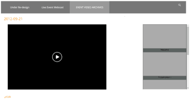
The alignment of the player and vertical playlist still has that wide empty space between them and does not look like the examples on your website. I tried right and left aligning the player in the options but it made no difference.
I am attaching a screenshot of the player/playlist for your reference.
Thanks,
Pesi
Hello Pesi,
I’ve checked these two links
http://tlabcvideos.org/wp/archived-videos/2012-09-21/
http://tlabcvideos.org/wp/archived-videos/hd-samples/and found, that player settings 720×480 don’t match a wide site like this (1200px). The easiest solution is to use a bigger player size 1280×720 with no alignment setting. This way all the place gets filled out nicely and without gaps.
(Your HD sample has currently align:right setting, you need to remove that).Thanks,
Viktor
That tip worked well for the HD Player page but not the others.
On the other pages I changed the player size to 720p but if the video is a 720X480 SD video (which most of them are in this project and others) it makes no difference to the appearance and the gap still remains.
Is it not possible to have the playlist adhere to the side of the player?
I know some other players do this.
See this page using another Player (Yendif) where the playlist stays connected to the video screen regardless of the size of the page: http://eventcastlive.ca/compare-packages-pricing/webcast-package-examples/

On another but related issue, could we not have the vertical playlist display optionally as just a text list instead of always requiring the thumbnails? To manually create hundreds of thumbnails from each video would be practically not feasible. The other player example I had shown you earlier does provide this option.

Hello Pesi,
I see that nobody answered you last couple of questions, sorry about that. Just let us know if the issue still persists.
FV Player now has the text playlist style, you can see it here: https://foliovision.com/2017/09/new-playlist-designs-and-visual-composer -> “New Paylist Style – Text”
Thanks,
Martin
