-
Hi, I am having trouble with the foliovision flowplayer plugin on mobile.
Here is a test page where you can see what is going on:
https://ballstrikingblueprint.com/members/home/fv-player-test/
If you look at the page source you will see that the width of the <div>’s that contain my player are 300px. I believe it originates with:
<div id=”le_body_row_2_col_1″ class=”one-column column cols”>
…followed by a few <div>’s that fill 100% width.
However then when we get down to the player:
<div id=”wpfp_b5ec056f04941441950fb45bdc32328f”…..
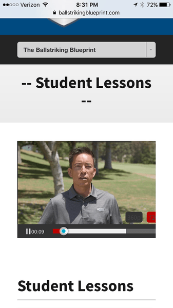
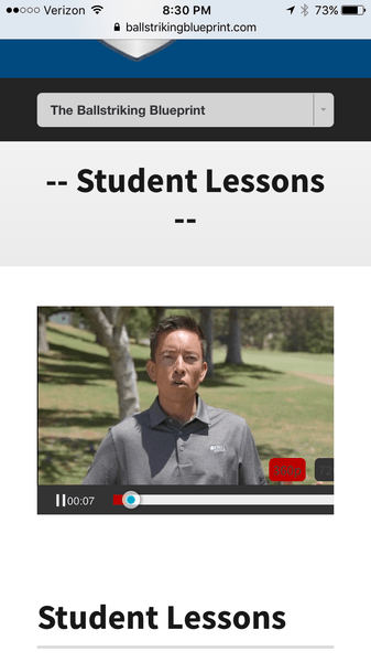
You will see it now has a width of 375px coded into it. If you play the video you will see that it is clipped and only showing the lower left corner of the video.
I have tried playing with the foliovision “Mobile Settings -> Force fullscreen on mobile (beta):” which seems to improve (or at least change) the behavior. When that box is checked the video will play in fullscreen and properly display the full width of the video. However, if I then hit any of the quality buttons at the bottom, the player reverts to it’s original clipped version showing just the bottom left portion of the video (and not in full screen).
Also, I am not sure which quality version the video is defaulting too when this force fullscreen on mobile option is checked.
Is there a solution for this? I’d really like the video to play properly on mobile!
Thank you in advance,
Aaron
P.S. attached images are:
1) with the force fullscreen option unchecked
2) with the force fullscreen option checked and playing in full screen
3) with the force fullscreen option checked AFTER I have changed the quality selection
Video player width on mobile
[Solved]
Viewing 4 replies - 1 through 4 (of 4 total)
Viewing 4 replies - 1 through 4 (of 4 total)


